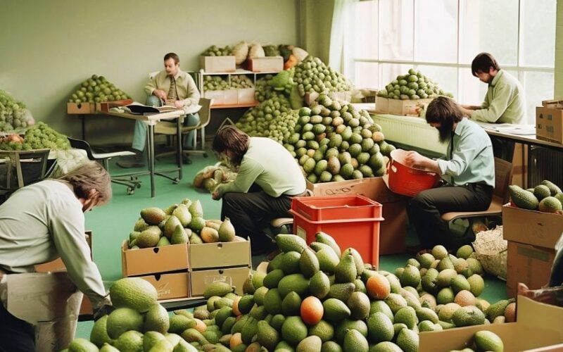
Following the conclusion of Dezeen’s reader competition to design the artwork for the AItopia series using text-to-image tools, here we publish the 10 shortlisted entries. To help introduce AItopia, our new editorial series exploring the short-term and future implications of artificial intelligence (AI) for design and architecture, we asked readers to come up with visual branding using generative AI programs...
Tilly Talbot announces «captivating and poetic» winner of Dezeen’s AI artwork competition
British architect and designer Selina Yau has won Dezeen’s competition to produce the artwork for our new AItopia editorial series using text-to-image software. Announced by AI designer Tilly Talbot, Yau’s haunting illustration was created using Midjourney. It shows a future with two hooded figures moving through a field of flowers facing a cluster of strange, cloud-like objects that contrast with...
Less than a week left to enter Dezeen’s £1,000 AI artwork competition
Thanks to everyone who has already taken part in our competition to use AI image generators to design the artwork for Dezeen‘s next editorial series. If you haven’t yet, enter for the chance to win £1,000! Our next editorial series, named AItopia, will explore how artificial intelligence (AI) will impact design and architecture. The winning design will form the artwork...
This week Dezeen launched an AI artwork competition
This week on Dezeen, we launched a contest to design the artwork for our upcoming series focused on how artificial intelligence will impact architecture and design. To mark the start of the series we are inviting our readers to create an artwork using artificial intelligence (AI) text-to-image generators, with the winner receiving £1,000. Along with the winner, 10 shortlisted designs will be featured...
Dezeen launches AI artwork competition for AI editorial series with £1,000 prize
Dezeen‘s next editorial series will look at how AI will impact design and architecture. To mark the start of the series we are inviting you to create its artwork using the text-to-image generators that are making headlines. Today we are launching the public contest to produce the illustration for our next series, with a £1,000 prize for the winning design. World’s...
Dezeen publishes 50,000th post
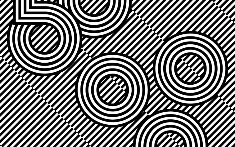
This is Dezeen‘s 50,000th article! To celebrate that dizzying milestone, we’ve commissioned a hypnotic illustration by London-based designer and artist Sarah Boris. More than sixteen years after being founded by Marcus Fairs from his spare bedroom, Dezeen is still going strong. The first ever Dezeen post was an unassuming news story on 17 December 2006, and we now publish around 75 every...
Neville Brody and Nike design «modular and slightly industrial» typography for England women’s kits
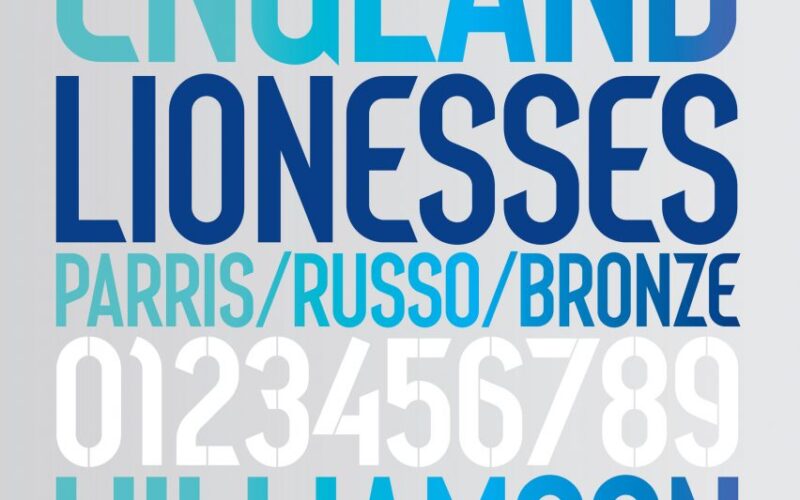
Graphic designer Neville Brody has collaborated with Nike to create a typography for the England women’s football kit that references the original Wembley Stadium’s art deco origins. The lettering and numbers are an updated version of the typeface that Brody created prior to the 2014 World Cup for the England men’s team football kits. Neville Brody designed the typeface in collaboration...
Siegel+Gale creates «authentic» branding for US Army
American agency Siegel+Gale has updated the logo and branding of the United States Army for the first time in more than 20 years. The rebranding includes the logo, fonts, iconography and the reimplementation the tagline «Be All You Can Be», which the military also used in the 1980s and ’90s. Siegel+Gale, a member of a consortium called Team DDB that...
Maarten Baas adds Las Vegas-style signs to Utrecht’s Neude Library
Dutch designer Maarten Baas has updated a historic library building with multi-coloured, illuminated signage. Baas designed the many-layered 3D sign for Neude Library in Utrecht, a former post office that is one of the Dutch city’s most revered buildings. Featuring bold graphics, playful typography and dynamic lighting, the installation gives a highly visible focal point to the library’s ordered facade. Maarten...
Pentagram designs cannabis branding to advocate for «communities deeply harmed by the war on drugs»
Design studio Pentagram has created branding that references the injustice of America’s war on drugs for Ben’s Best Blnz cannabis company, which was launched by Ben & Jerry’s co-founder Ben Cohen. Pentagram was tasked with distilling these values into the packaging and brand identity for Colorado-based Ben’s Best Blnz (B3), using a selection of colourful backgrounds with bold graphics with...
Fanta rebrands with «truly playful» global identity
Coca-Cola‘s design team and creative agency Jones Knowles Ritchie have overhauled drink brand Fanta’s logo to give it a unified global identity based on fun. The rebrand, led by the design team at drinks brand Fanta’s owner The Coca-Cola Company in collaboration with Jones Knowles Ritchie, aimed to give the brand a playful image that appealed to all ages. «Fanta is one of...
This week we revealed Pepsi’s first rebrand in 14 years
This week on Dezeen, we published drinks brand Pepsi’s new logo, which drew from the past and looked to the future while aiming to be «undeniably Pepsi». Released to mark Pepsi‘s 125th anniversary, the rebrand drew on its 1990s logo and used black wording to draw attention to Pepsi Zero Sugar. «We designed the new visual identity to connect future generations with...


