Graphic designer Ian Cartlidge has joined Dezeen Awards 2024 as a judge. Here he selects five projects that best reflect his studio’s work. Cartlidge is the co-founder of London design studio Cartlidge Levene and considers the core ethos of his work to «produce design that makes a meaningful and positive contribution to the world». The British designer told Dezeen that...
Lamborghini redesigns bull and shield logo after twenty years
Italian automaker Lamborghini has unveiled a rebrand featuring a flat, simplified logo as part of a broader «transformation process» aimed at sustainability and decarbonization. The logo has the same set-up – a bull placed at the centre of a shield, but the detailing has been pared down into a silhouette, while a broader, thinner typeface was introduced. «The new logo...
Soniah floor lamps by Faina
Dezeen Showroom: produced by Faina, the decor brand of Ukrainian architect Victoria Yakusha, the Soniah floor lamp is a dramatic piece that appears to grow from the ground. Yakusha referenced Ukraine’s national flower – the sunflower – in both the name and the form of the Soniah floor lamp. The Soniah floor lamps are inspired by Ukrainian cultural heritage and sunflowers Available...
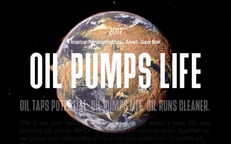
Beatie Wolfe visualises oil industry «disinformation» in Smoke and Mirrors video
Methane data and dishonest oil company advertising are juxtaposed in Smoke and Mirrors, a new visualisation produced by artist and musician Beatie Wolfe in collaboration with visual effects studio Parliament. Debuting last week at South by Southwest, Smoke and Mirrors doubles as a video clip for Wolfe’s song Oh My Heart, which was released in 2022 on the world’s first...
Architectural landmarks star in «utopian» poster for Paris 2024 Olympics
French artist Ugo Gattoni has created a duo of intricately hand-drawn posters for the Paris 2024 Olympic and Paralympic Games, which can function independently or combine seamlessly to create a single composition. It marks the first time that posters for both summer games were designed together as a diptych, according to the Paris 2024 Organising Committee. Ugo Gattoni has designed the...
Lyle’s Golden Syrup changes dead lion logo after 150 years
British company Tate & Lyle Sugars has unveiled a rebrand of its Lyle’s Golden Syrup for the first time since the inception of the sugar syrup brand in the late 19th century. The branding – confirmed by Guinness World Records as the oldest unchanged brand packaging – was updated to remove the illustration of a dead lion surrounded by bees...
BIG unveils visual identity for Denmark’s 3 Days of Design festival 2024
Danish architecture firm BIG has designed the 3D graphics that define the identity of this year’s 3 Days of Design festival in Copenhagen under the slogan Dare to Dream. The theme for this year’s festival, Dare to Dream, aims to explore how good design can serve an emotional function as much as a practical one. Copenhagen-based BIG – which is...
Five African football logos that «tell a tale of identity»
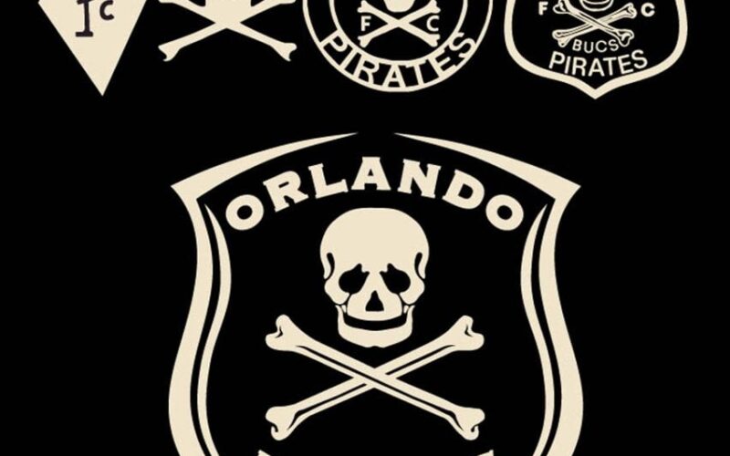
Afrosport is a new book by Peet Pienaar that explores the visual culture of African sports. Here, the designer selects five football logos from the book and explains their role in celebrating unity and independence. Unveiled alongside the 34th edition of the African Cup of Nations (AFCON) football tournament, which is currently underway in Ivory Coast, Afrosport was created by...
Dezeen Agenda features Herman Miller’s first rebrand in over two decades
The latest edition of our weekly Dezeen Agenda newsletter features the reveal of Herman Miller’s new brand identity. Subscribe to Dezeen Agenda now. New York design studio Order has conceived a new brand identity for furniture retailer Herman Miller that draws inspiration from the American brand’s history. The Herman Miller wordmark has been reimagined in the contemporary Söhne typeface from...
Herman Miller unveils first rebrand in over three decades
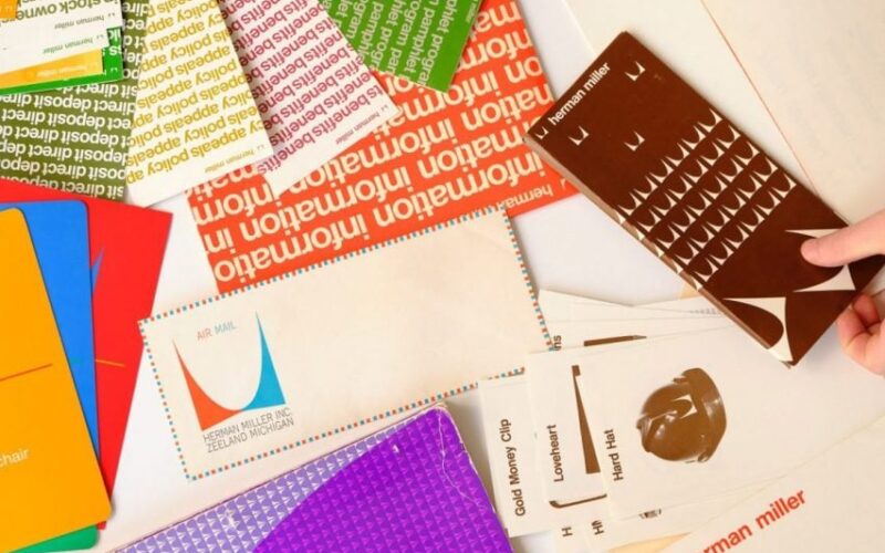
New York design studio Order has created a nostalgic new brand identity for Herman Miller that harkens back to the mid-century modern heritage of the American design brand. Last updated at the dawn of the World Wide Web in the early 1990s, the branding previously featured the «computer-friendly» FF Meta font and the company’s enduring M logo from 1946, emblazoned...
Modibodi’s First Period Kit aims to destigmatise periods as «shameful and taboo»
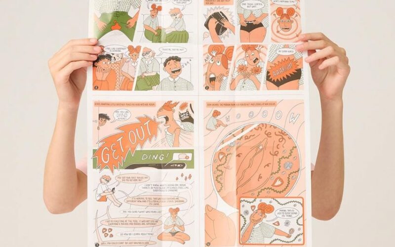
Underwear brand Modibodi and illustrator Justyna Green have collaborated on the relaunched First Period Kit, which includes a comic that speaks to teenage girls’ first experience of getting their period. The kit includes a comic and sticker kit designed by Green and several Modibodi products, including a waterproof bag for changing, two pairs of Black Hipster Bikinis and a handheld mirror...
Dezeen’s top 10 rebrands and logo redesigns of 2023
In this roundup, we continue our review of 2023 with a collection of notable rebrands and logo redesigns, including Twitter’s switch to «X» and a revamped look for the «I NY» logo. Other rebrands in this roundup include refreshed looks for drink brand Pepsi and fashion house Burberry, as well as a simplified brand identity for the US Army that...


