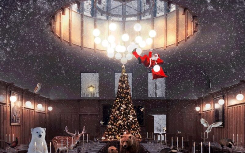
Citroën returns to original logo to create «symbol of progress» for electric era

French car manufacturer Citroën has unveiled a new logo that recalls the brand’s original 1919 logo, to mark the start of a «dynamic era» and its mission to make electric vehicles more accessible. The new logo, which was created by the Citroën design team and global brand design agency Stellantis Design Studio, sees the return of the oval to enclose...

London Fire Brigade «celebrates bravery» with exhibition marking launch of updated typeface

The London Fire Brigade has unveiled its updated typeface designed by Studio Sutherl& and The Foundry Types at the Running Towards exhibition of graphic artworks informed by the organisation’s design heritage. The Running Towards exhibition took place at the Shoreditch Fire Station during the London Design Festival, with visitors entering through the building’s big red shutters into a display of artworks...

dezeenmagazine

Peter Saville updates Ferragamo brand identity with custom typeface

British graphic designer Peter Saville has created an updated brand identity for Italian fashion house Ferragamo, transforming its handwritten logo into a custom serif typeface that references stone inscriptions. The fashion house revealed its new name and logo by means of an Instagram post that was captioned «Salvatore Ferragamo becomes FERRAGAMO.» The updated single-word logotype, which was designed by famed...

The IOC reveals updated brand identity for the Olympic Games

The International Olympic Committee has unveiled its brand identity for the Olympic Games, which includes custom typefaces, illustrations and graphics that aim to bring the legacy of the games into the modern world. Canadian creative agency Hulse & Durrell partnered with the International Olympic Committee (IOC) to develop three custom typefaces, a series of graphics, 17 illustrations and a set...

dezeenmagazine

OlssønBarbieri plays with Bordeaux wine rules in Château Picoron rebrand

To reflect the restrictive winemaking regulations in the French region of Bordeaux, Norwegian studio OlssønBarbieri set itself constraints when coming up with a playful brand identity and packaging design for the winery Château Picoron. Established in 1570, Château Picoron was recently bought by an Australian family who wanted to change everything about the brand identity but the name. They wanted...

dezeenmagazine

Motive Inc bases signage for Japanese rail company on train tracks

Japanese studio Motive Inc has created a highly tailored wayfinding design for the training institute of railway maintenance company Totetsu Kogyo, using stylised floor markings to guide visitors through the building. Located in the city of Tsukubamirai in Ibaraki Prefecture, the Totetsu Training Institute features flowing lines reminiscent of railway tracks embedded into its floors, leading the way to various rooms....

Typotheque typography project aims to protect Indigenous languages from «digital extinction»

Type foundry Typotheque has created a series of new typefaces and proposed changes to the way that digital characters are encoded to make it easier for Canadian Indigenous communities to write digitally in their own languages. The North American Syllabics project saw the Dutch studio work in close collaboration with groups that use Canadian Aboriginal syllabics – a family of...

Road Research Society digitises hand-drawn Hong Kong road signs for Prison Gothic font

Non-profit organisation Road Research Society has digitalised the text from old road signs in Hong Kong to create a font called Prison Gothic as part of its effort to preserve «visual cultural memories of the city». The font, which so far includes 8,000 commonly used Chinese characters, is modelled on 600 characters collected from road signs on the city’s streets....

Peter Saville unveils «subtle but necessary» update to Aston Martin logo

British luxury carmaker Aston Martin has revealed an update to its winged logo created by legendary designer Peter Saville. The redesigned logo remains very similar to the previous one, with the most noticeable change the removal of a semi-circular line running through the wings. «The Aston Martin wings update is a classic example of the necessary evolution of logotypes of provenance,» said Saville....

Dark Igloo rebrands magic mushrooms with «trustworthy» identity for PLANT dispensary

Subtle references to the experience of taking magic mushrooms are incorporated into the branding and packaging that Brooklyn studio Dark Igloo has designed for psilocybin dispensary PLANT. The secretive shop is set in an undisclosed location and has no online presence, but was in need of distinctive packaging for its tinctures, capsules and chocolates containing psilocybin – the active compound found...

«Undiscovered legacy» of Lucia Eames showcased at Milan design week

The rarely seen graphic and furniture designs of Lucia Eames, daughter of midcentury icons Charles and Ray Eames, have been unveiled in an exhibition during Milan design week. The late Lucia Eames produced creative work throughout her life. But her career was primarily focused on protecting the legacy of her father and stepmother, so her own designs took a backseat. Lucia...