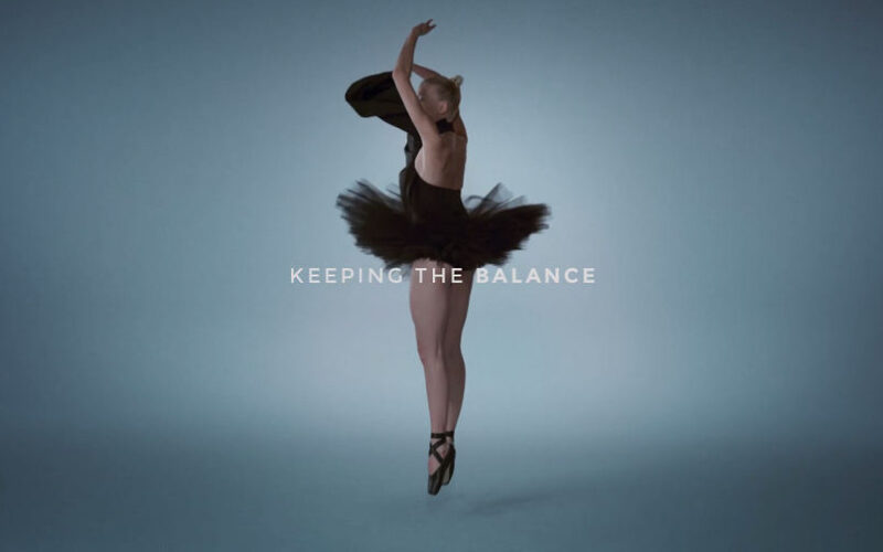
It’s been well documented that vinyl is well and truly back as the discerning music-lover’s format of choice: according to the Vinyl Factory, UK vinyl sales revenue is set to overtake CD sales this year for the first time in 30 years. But even though we’re in the midst of this vinyl revival, there’s one relic from 20th century record...
Why British record store carrier bags are graphic design icons
It’s been well documented that vinyl is well and truly back as the discerning music-lover’s format of choice: according to the Vinyl Factory, UK vinyl sales revenue is set to overtake CD sales this year for the first time in 30 years. But even though we’re in the midst of this vinyl revival, there’s one relic from 20th century record...
How A Clockwork Orange infiltrated pop culture
As A Clockwork Orange turns 60, and its movie adaptation turns 50, Daniel Benneworth-Gray examines the complex relationship between the book and the film, as expressed by the evolution of its covers over the decades...
Woo is on a mission to rebrand wellness
Backed by ITV, the new media brand is ditching the wellness industry’s well-worn tropes in the hope of redefining self-care for Gen Z audiences...
Malibu launches trippy new ad campaign
The mainstream good vibes of Meyers’ music videos is carried into the spot for Malibu, which also features a video game feel throughout. The spot opens as its central character enters a fictional hyper-real version of Malibu, where the sun always shines, there are cocktails on tap, and the fun never ends. Plus there’s also a horse made of coconuts...
Un currículum en forma de carátula de VHS de los 80
MikaeliFX es un diseñador gráfico autodidacta de Finlandia cuyos diseños se caracterizan por mezclar la estética de los años 80 con tendencias actuales. Ya había visto algunos de sus diseños en Instagram, pero el otro día encontré algo que me llamó mucho la atención y me apetecía compartir por aquí: su currículum vitae con forma de carátula de VHS. No...
Model. Festival de Arquitecturas de Barcelona. Del 5 al 15 de mayo
Del 5 al 15 de mayo, un circuito de siete kilómetros que delimita la frontera entre Ciutat Vella y el Eixample, será el escenario de la primera edición de Model. Festival de Arquitecturas de Barcelona, un macroevento organizado por el Ayuntamiento de Barcelona y el Colegio de Arquitectos de Cataluña… La entrada Model. Festival de Arquitecturas de Barcelona. Del 5...
CFC diseña la identidad de Vivevive. La celebración de la femineidad
El estudio coreano CFC, fundado en 2013 por Charry Jeon, ha sido el encargado de desarrollar la identidad y el packaging de Vivevive, una exclusiva marca de ropa interior femenina diseñada especialmente para afrontar los periodos menstruales. La entrada CFC diseña la identidad de Vivevive. La celebración de la femineidad apareció primero en Experimenta....
Protegido: ESNE presenta la primera edición de su Máster Oficial Universitario en Ilustración
No hay extracto porque es una entrada protegida. La entrada Protegido: ESNE presenta la primera edición de su Máster Oficial Universitario en Ilustración apareció primero en Experimenta....
TOKYO REVISITED
TOKYO REVISITED es el título de la última exposición del MAXXI (Museo Nazionale delle Arti del XXI Secolo) de Roma. La muestra presenta el trabajo de los fotógrafos japoneses Daido Moriyama y Shomei Tomatsu, quienes durante sus prolíficas carreras han representado las muchas transformaciones sociales y políticas que ha vivido la ciudad de Tokio desde el fin de la Segunda...
Tipografía Celta
Fuente: Envato Elements Las tipografías, también han sufrido grandes cambios a lo largo de la historia. Tanto es así, que muchas tipografías se diseñaron con el objetivo de iniciar nuevas invenciones que ayudasen de esta forma a satisfacer nuevas necesidades en sociedad. Lo que pocos desconocen, es que existen distintas tipografías que, por sus diseños, mantienen un pasado detrás, que ha...
Who ❋ Needs Words ✎ When You ➰Have Symbols❓
What are you seeing? In-line images and symbols, reminiscent of old chain letter text messages or everybody’s favorite ’90s font, Windings, are back and breaking into branding. The most common version of the trend, which we’re calling Nouveau Rebus, uses dingbats or emoji-like symbols sandwiched in between words, but rebus content can take the form of everything from geometric shapes...