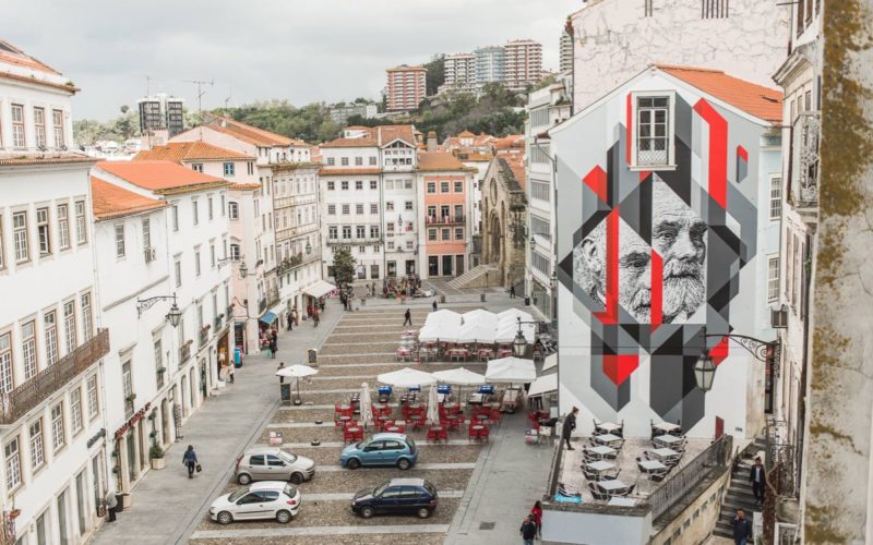
Mat Voyce — Leeds, UK

“My Donut Worry piece was originally based on wanting to create a set of positivity stickers or badges to share on Instagram and GIPHY. This was before the worldwide lockdown came into force so they didn’t have their true impact until then. But I really wanted to make a few clever little badges to make people smile using puns and...

TypeTogether — Veronika Burian, José Scaglione — Prague, Czech Republic

“A typeface needs to be designed as a system with logical relationships between the elements that make it distinct from lettering. However, this does not mean that everything has to look the same. What can be interesting and exciting is consistency within inconsistencies, without becoming random ‘creativity’. When judging the quality of a font, it is important to look out...

Craig Black — Gourock, Scotland

What constitutes a good typeface design? “A major consideration for me is consistency. A well-designed typeface will have consistent design characteristics throughout the entire character set, which includes numerals, punctuation, and some symbols. This includes cap and x-heights, the overhangs of curved characters such as the o, n, and e, character width, stroke width, size of the ascenders and descenders,...

ChArchiLab — Glimmering White Cube — Kaohsiung, Taiwan

The interior avoids unneeded ornaments; whereas, exterior was renovated by cement and cladded with perforated metals, building up translucent contrast between solid and see-through material. The perforated facade brings more daylighting and creates blurry yet inviting shadow from outer surrounding, eliminating visual barricades among vertical stores. This old house becomes a new, flexible, light-weight, carrier to cater for unknown activities...

Mikhail Sharanda — Shenzhen, China

“My initial idea was to design an extremely simple font that nonetheless feels exceptional. The beginning was easy, I just enjoyed drawing each letter one by one how I wanted. But then the hardest part came: testing, fixing, countless kerning adjustments, re-drawing glyphs over and over … It’s been three years now. What kept me going is the feeling that...

Ion Lucin — New York, USA

“In all of my typefaces, inspiration can come from anywhere. It can be something related, you can be inspired by another typeface, make something similar, better, or go into the totally opposite direction, or inspiration can come from something that doesn’t have anything to do with typography — a line on a building, a curve on a car; many times,...

Lewis McGuffie — Tallinn, Estonia

“I recently re-made an old font of mine called Cindie Mono — the update is called Cindie 2. The original idea for the font came from the monospaced letters used on medical opticians’ charts. I found the simplicity of the letters and the scientific approach to legibility interesting. The update of Cindie 2 has a hand-drawn script face also. This...