The 2021 Golden Pin Concept Design Award (GPCDA) announces 45 Design Mark winners who are progressing to the final selection and competing to win a share of the Award’s TWD1,200,000 (USD43,000) prize and coveted Best Design trophy. Of the 45 Design Mark winners — there are 18 in product design, 18 in communication design, 6 in spatial design, and 3...
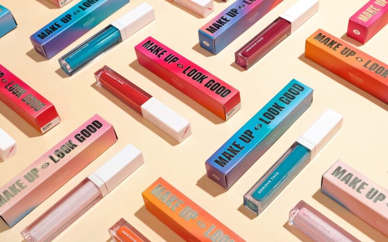
Serious Studio — Deane Miguel-Cruz, Lester Cruz — Pasig, Philippines
“We can see sustainable packaging happening even more in the next few years. Sustainability is no longer just a trend, but a consumer expectation from brands. We have been encouraging our clients to make the switch to more sustainable packaging, as every small bit makes a part of the huge change we are all trying to push for — a...
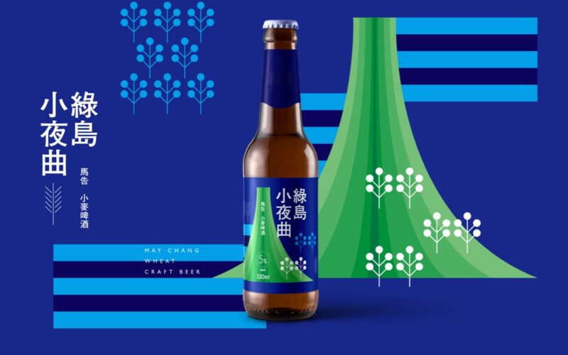
Aaoo Studio — Louis Chiu — Tainan, Taiwan
“The weaving-a-tea-story gift box is one of the projects that we are most proud of. In the initial stage of the project implementation, because the customers come from three groups of different backgrounds, in order to unify an acceptable design plan, we paid a lot for the communication of needs, the time and effort necessary to integrate opinions with customers....
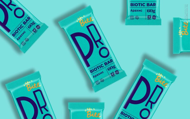
Milica Pantelic — Belgrade, Serbia
The most challenging and satisfying projects to date? “The Probiotics Bar identity and packaging design. I designed the concept that included naming, as well as a packaging design. The target audience was younger adults with healthy, fast-paced, modern lifestyles. My concept is based on dynamic design for dynamic people. Bold typography communicates the professional approach of BioFoodLab to the innovative...
Vighnesh Dudani — India
“I want to see a significant rise in the use of sustainable packaging. While developed nations are already on this path, other countries will perhaps take a lot longer, mainly due to economic and social challenges. Yet if not sustainable, packaging can surely be designed to not only be re-cyclable but also returnable, re-purposable or re-fillable. This I believe can...
A’Design Award & Competition 2022 — Top Winners Announced — Italy
A’Design Award & Competition, one of the World’s largest and most diffused international design awards announced results of the 2020-2021 design competition: 2,094 Winners from 108 countries in 104 different design disciplines. Entries were carefully evaluated by an internationally influential jury panel composed of established scholars, prominent press members, creative design professionals and experienced entrepreneurs who devoted great care and...
Emi Renzi — Buenos Aires, Argentina
His greatest inspiration comes from the different cultures of the world, especially music and the expression of urban art. He has worked on various projects for studios and brands in Brazil, Chile, Germany, Mexico, Spain and the US, and several Asian countries such as India, Japan and Singapore....
Kij Studio — Panyagal Oh, Dongwon Oh — New York City, USA
“One of our current projects — packaging for a high-end CBD (cannabidiol) skincare brand. We aim to represent our client as the Louis Vuitton of the CBD industry. How to create a sense of luxury without falling back on clichéd symbols, such as flora and fauna graphics? With transparent communication with your client, and deliberate experimentation, you can achieve a...
Plácida — Granada, Spain
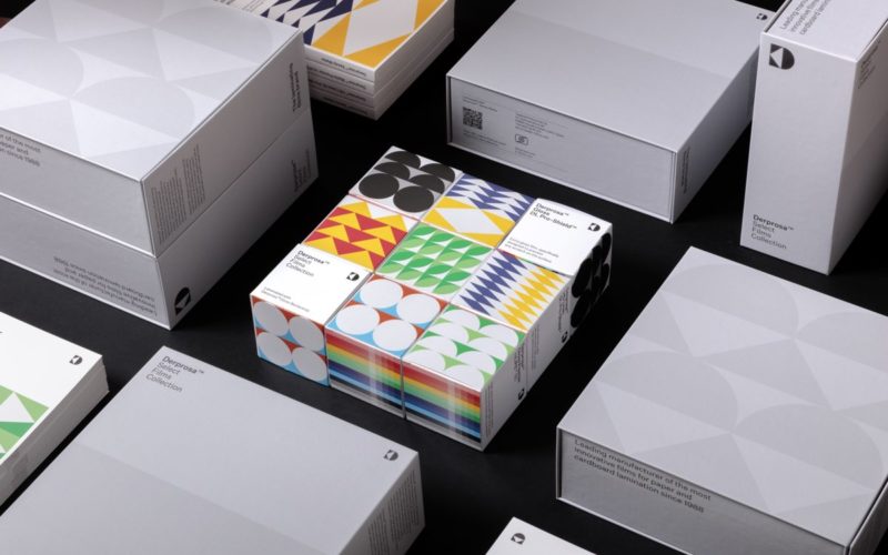
Your most challenging and satisfying projects to date? “Undoubtedly the brand re-design for Derprosa, a brand of laminating films for paper and cardboard for the packaging and print communication sector. We wanted to convey its corporate identity with a visual system more akin to the world of graphic design. The challenge was to provide a graphic identity for its more...
Arithmetic — Margherita Porrà — Vancouver, Canada
“The projects that make our heart beat faster are the ones that have a bigger values-driven mission woven through the tapestry of the brand and shown through the materiality and innovation of the packaging — when those collide, we have a chance to shift behaviour.”...
Lavernia & Cienfuegos — Valencia, Spain
“All projects involve a challenge that does not always correspond to their complexity or scale. Sometimes small projects for small companies force you to overcome more obstacles due to the limited resources available. This is the case with packaging for Utopick, a small bean-to-bar chocolate workshop. All the work is hand-made and hand-packed. The challenge was to improve the packaging...
Michael Moodie — Nightshift — Seattle, USA
“Thinking beyond the product itself into full un-boxing experiences, I’m expecting to see a lot of additional peripheral elements that will be used to help tell the brand story.Visually I’m expecting to see a continuation of the current trend of minimalist design aesthetics. We are also seeing a new brutalist trend carried over from many modern design applications into packaging.”...


