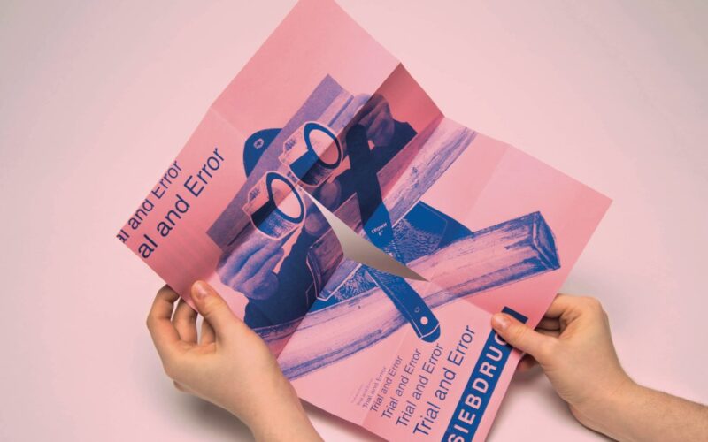
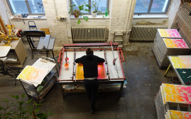
Why do you like screen-printing? “Unlike digital printing, you can use special colours such as neon or metallic inks. Also, you can print on almost all surfaces — paper, cardboard, glass and textiles. Duplication is another big advantage. Once the screen is coated, it can be used many times. The process of preparing, taping and de-coating the screen is probably...
Natalya Balnova — New York, USA
Why do you like silkscreen? “First of all it gives me the ability to freely transfer my ink drawings to the print-making format and preserve the organic nature of the brush lines. The original drawings are done in black ink only, but while I am working on the final files for the silkscreen separations I add extra colours digitally in...
Rafael Neder — Belo Horizonte, Brazil
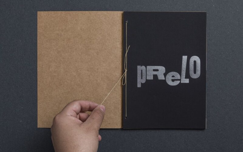
“I’m really interested in the crossroads between analogue and digital technology. Letterpress is a good place to practise these intersections. The materiality of movable types fascinates me to the point of creating new dies in CNC, laser or even 3D printing to be able to experiment with new types in the press.”...
Guayabo — Belo Horizonte, Brazil
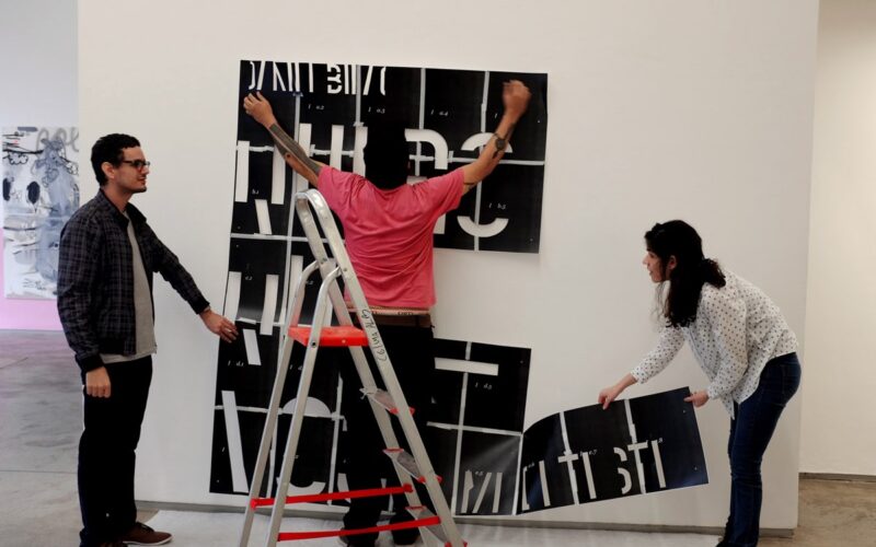
What is your favourite speciality in printing production? “We have experimented with engraving, risograph, silkscreen, stencil, typography, sublimation, UV printing, tampography, embossing, foil, die-cut, letterpress, rubber stamping, off-set and digital printing and cannot choose a favourite among them. When we pick a printing method, we consider two main criteria: the visual and material aspects resulting from the selected technique, in...
Puñalada — Santiago, Chile
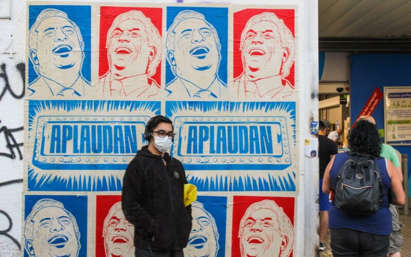
“My personal challenge is to continue turning screen-printing onto the street, to continue passing that knowledge on to people through workshops or street interventions, re-defining the communicational power of screen-printing and finally achieving large screen-printing on walls. Something like silk-screened murals. It is my big dream.”...
How To Ink — Singapore
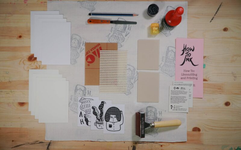
Why do you like to make prints the way that you do? “To produce a print, all we have to do is click on the computer, or even a phone. But print-making brings you through a process, from designing it, how you layer the colours, how to align the different layers and choosing and mixing the right colours, etc. To...
Mr Cup Creative Studio — Fabien Barral — Arles, France
“I have collaborated with Studio Pression for years to print my project. This is like a band, I write the song, but without their amazing music, it would be nothing. They always bring me ideas and take my project to another level. For the 2015 calendar, for example, they told me ‘Hey, it is the year of light, we should...
Forth + Back — Nikolos Killian & Tanner Woodbury — Los Angeles, USA
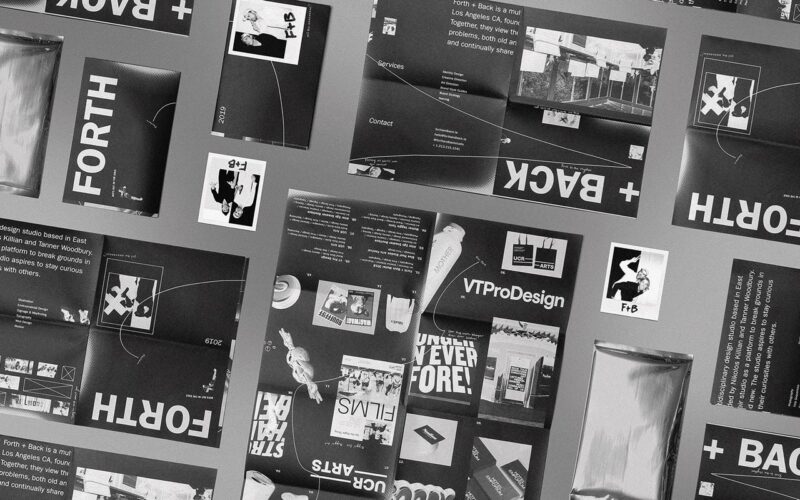
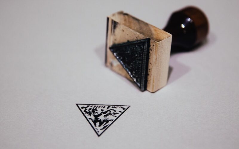
What are the challenges to foil stamping? “To name a few: colour matching, bleed problems, as well as layering issues that can arise from the colours you use and the materials you use them on. However, these challenges are what make print projects different from digital and hopefully more memorable. We love using foil stamping and similar stamp processes because...
Tind — Manolis Angelakis — Athens, Greece
Why do you like silkscreen printing? “It’s the whole process we love. At the very beginning we had to find the right ink and there wasn’t any, so we made our own, totally skin safe. We often work live at public events. You are like an illusionist but one with only one trick! And printing at live events got us...
Hiii Illustration International Competition — Nanjing, China
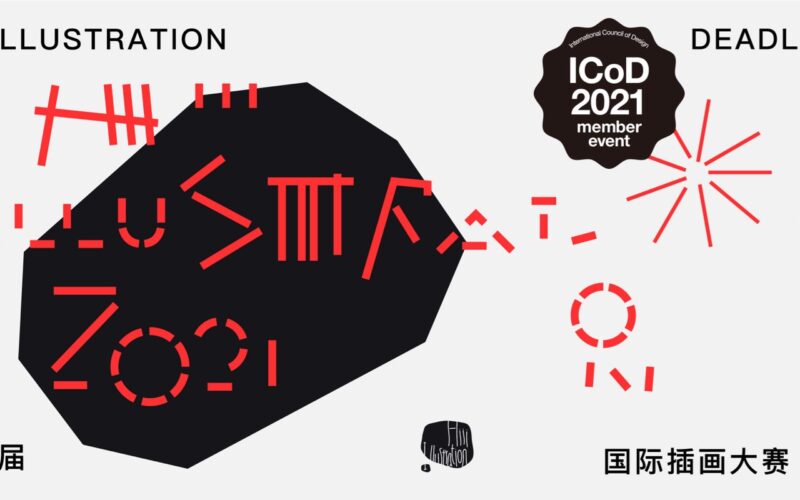
Hiii Illustration 2021, or The 9th Hiii Illustration International Competition, opens to all illustrators, creative professionals and agencies, teachers and students worldwide, aiming to discover and reward outstanding illustration talents and works from all over the world, in an effort to advance the global development of illustration. After 9 years of accumulation, the Hiii Illustration International Competitions have become one...
Isaac LeFever — Seattle, USA
Why do you like risograph? “I like it in part because it’s really quirky and obscure. The machines and ink drums are hard to come by and when you do find them, you usually have to do a decent amount of maintenance and trouble-shooting to get and maintain good results. There aren’t a lot of people who specialise in repairing...
A’Design Award & Competition 2022 — World Design Rankings — Italy
World Design Rankings (WDR) ranks all the countries based on the number of designers that have been granted with the A’ Design Award. WDR is to Design what Olymics is to Sports. The idea behind this friendly competition is to inspire innovations and outstanding designs. A’Design Award and Competition is one the world’s largest and most influential design award; extremely...
