“A campaign poster has specific communication/business objectives whereas a personal poster can have a range of goals, e.g. social commentary, observation, communicating a mood or just something interesting to look at.”...
Brian Ewing — Columbus, USA
“When I work with a band I only have to focus on what they need from me. When working on a campaign, I have to consider the client and the sponsors of the event. It’s a lot of people with ideas and a lot of boxes that need checking off for the design to work for the client. It just...
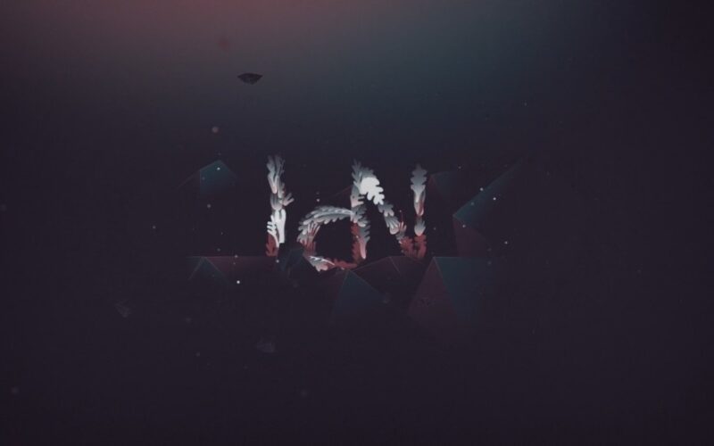
LWZ — Ident for IdN (0:29)
30sec Motion Identity for IdN Magazine...
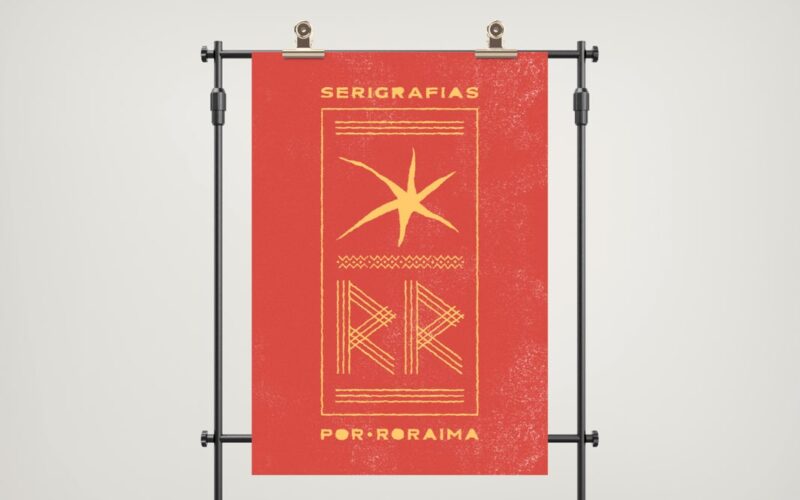
Thiago Benato — Curitiba, Brazil
He considers himself to be “a person who has more guts than so-called talent, so I try to work hard to achieve my goals, always driven by a passion for the craft”....
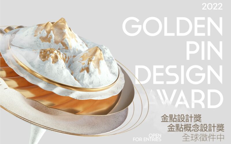
Call for Entries Open for 2022 Golden Pin Design Award and Golden Pin Concept Design Award! — Taipei, Taiwan
The call for entries is now open for the 2022 Golden Pin Design Award and Golden Pin Concept Design Award, and the names of several international jurors have been revealed. The Golden Pin Design Award is for commercialized products that are already available on the market or completed projects. Entries will be accepted until 7 JUL, and those who register...
Mariano Arcamone — Buenos Aires, Argentina
“Designing a poster as part of a campaign gives you the chance to develop a concept through the different pieces of a graphic system. Some of them will be simpler, others more complex, but they should all appear to be part of the same group.When you design a poster on its own, you have to concentrate all of your graphic...
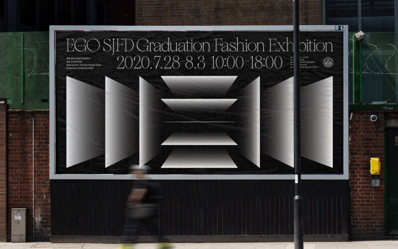
Minhyuk Jo — Seoul, South Korea
“When designing campaign posters, you should repeatedly check if the message is being delivered well. But with personal posters, you don’t have to do that. Just focus on the expression.”...
Ola Niepsuj Studio — Warsaw, Poland
“When designing a commissioned poster you need to adhere to a discipline — your main goal is to convey specific information to the possibly completely uninformed, random viewer. With a self-commissioned poster, both the process and the final design can be an artistic event. You can depict the key theme in the most honest way, provide personal commentary and show...
Bisoñ Studio — Krakow, Poland
“We are great team-mates in life as well as at work. We are two different entities, but that’s what makes us and our work complete. The projects we create are original, integrated and thoroughly thought-out.”...
Monika Lang — Belgrade, Serbia
“A good poster should deliver its message in a unique, clear and memorable way. It should instantly catch the eye of the viewer, which gets harder every day because the attention of people is dispersed more and more by the ever-growing amount of information they receive on daily basis.”...
ESH Gruppa — Moscow, Russian Federation
They say they “value clear concepts and unusual forms — this way, we create vibrant, cutting-edge projects”....
ESH Gruppa — Moscow, Russian Federation
They say they “value clear concepts and unusual forms — this way, we create vibrant, cutting-edge projects”....
