How does technology influence or expand your creativity towards Game Art Design? “A good example would be graphic tablets. Last year I bought a pen display tablet; I was sceptical at the beginning because I worked for many years on regular graphic tablets and I was used to them, but I wanted to try something new. Now I don’t want...
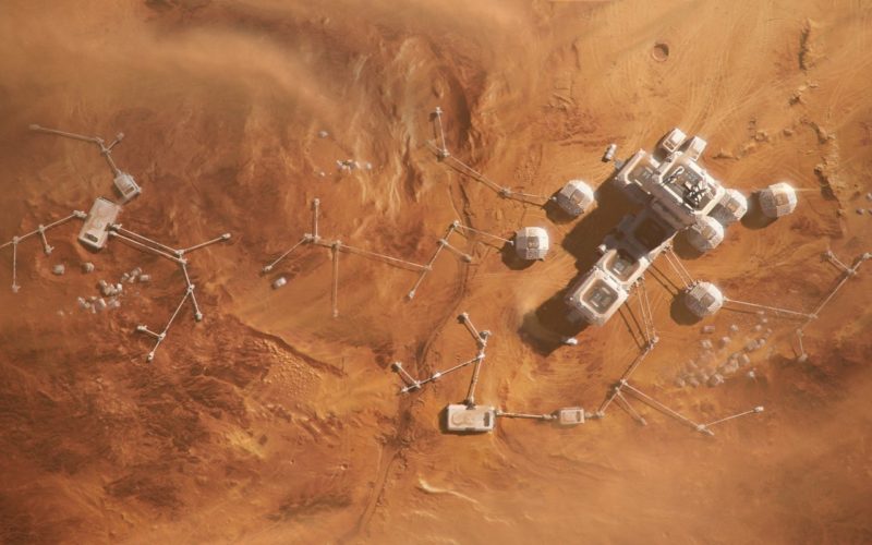
Andrey Vasilyev — Kyiv, Ukraine
What would be the next big thing for Game Art Design? “Besides the modern-day development of technology and increasing computing power (which enables a very high level of realism), there is a constant simplification of creating processes, blurring the line between the concept and ready product. A lot of people now can implement their ideas and not be stuck in...
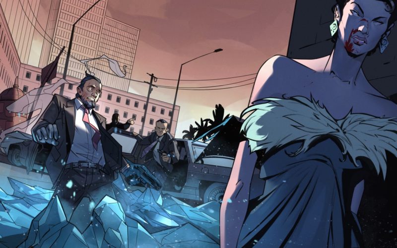
Antibody — Patrick Clair & Raoul Marks — New York, USA
“We’ve noticed a trend of video games ‘maturing’ in the way they want to present their product to consumers. Specifically, our gaming clients increasingly look towards the work we’ve done for film and TV series and aspire to have something similar. Our gaming work used to be very focused on informational world building, with a lot of detailed voiceovers and...
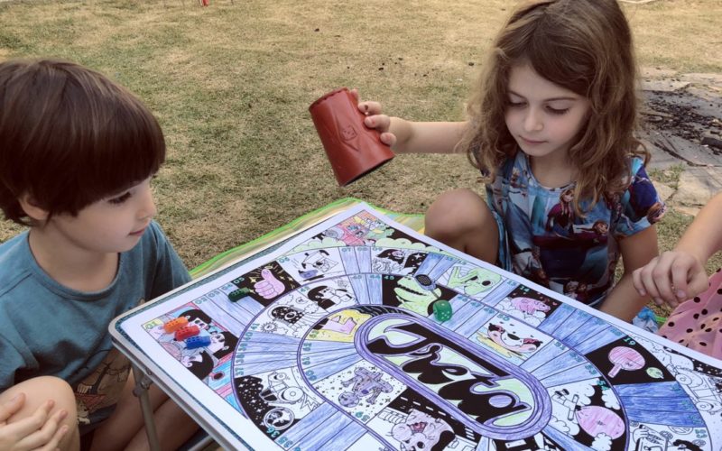
Estudio Pum — São Paulo, Brazil
“Our intention with Treta was to create something for children and parents to play together during the quarantine as an opportunity to share something that could be fun for both of them.”...
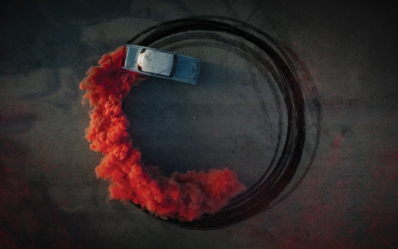
Emrah Özbay — Maribor, Slovenia
“In my opinion, the next big thing for Game Art Design is games without interface. The virtual world is the near future of games, but what comes after that is real reality. There will be no interface, only the game and us. I believe that the next chapter of most games can be in real life and at real size....
Fernando Forero — Munich, Germany
“If technology simplifies the ways we create art content for a video game it means that we can have more time to explore creatively and go places we have never been before. Many things will be automated and that is a benefit for game creation, but also a risk for human work opportunities, and we must take responsibility for social...
Murat Kalkavan — Istanbul, Turkey
How does technology influence or expand your creativity towards Game Art Design? “I like to use all the tools that will take my art to the next level. The use of AR technology, especially in board games, excites me.”...
IdN v26n4: Game Art Graphics — Let the Games Begin!
You may imagine that it would take a veritable army of artists, programmers and designers in order to make a game “happen”. That’s not entirely true, some of the contributors have worked with just a few other people. But certain roles are indispensable....
A’Design Award & Competition 2021 — World Design Rankings — Italy
World Design Rankings (WDR) ranks all the countries based on the number of designers that have been granted with the A’ Design Award. WDR is to Design what Olymics is to Sports. The idea behind this friendly competition is to inspire innovations and outstanding designs. A’Design Award and Competition is one the world’s largest and most influential design award; extremely...
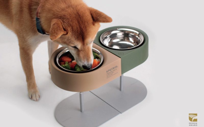
Sputnik Co — NON-ANTS Bowl — Taipei, Taiwan
From the perspective of functional aesthetics, the NON-ANTS Bowl can be freely combined to show various forms with practicability and taste. The special floating bowl design can prevent ants from disturbing the pet and provide the pet a comfortable dining experience with healthy diet....
Moments 2020: Uma Mural Art Project — Málaga, Spain
The UMA Mural Art Project initiative — brought to you by MOMENTS Festival 2020 — has filled the walls of the Art Teatinos Campus, featuring the works from artists including: Mur0ne, Isa Nieto and Dreucol....
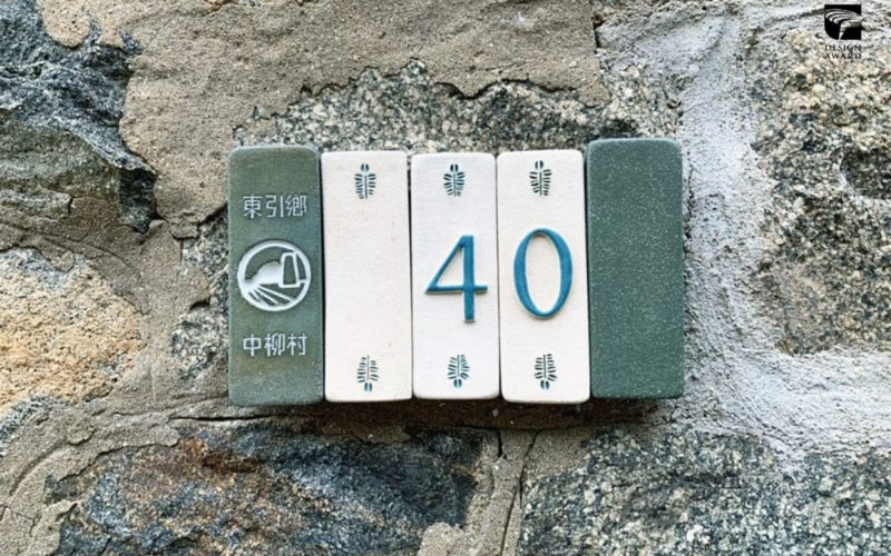
Toraton Creative Studio Co. — Dongyin Township Doorplates — Taipei, Taiwan
The color of doorplates is inspired by the research “Searching for colour of Matsu”. The sea colour around Dongyin is a mix of pale blue-green with hints of grey. Considering the strong wind of Matsu and the granite surface of Matsu Stone is uneven, and the divided doorplates can reduce the potential risk of falling due to incomplete attachment....
