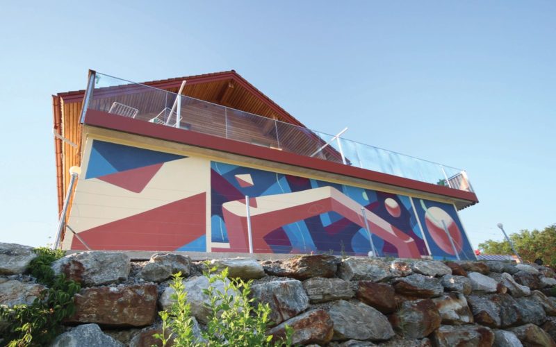
“Dunkel Sans is a buzzing heavyweight display font, perfect for leaving a fierce impression on posters and signage applications. Dunkel is the German word for dark and as the name implies, it is designed to be super-black. When I visit Korea, I walk through the streets and visit bookstores to observe the trends. It seems there are not many diverse...
Font Reneagade — Jan Charvát — Prague, Czech Republic
What constitutes a good typeface design? “The balance between blacks and whites — because the whites in-between have the same importance as the blacks; rhythm — because if the design does not have good rhythm it is like mixing two tunes with different beats (painful); proper technical execution — because if it is not well crafted it will fail to...
CAST — Cooperativa Anonima Servizi Tipografici — Bolzano, Italy
“In designing Sole Sans, we took our inspiration from the San Serif lettering of English 18th-century neo-classical architects such as George Dance. The Caslon Foundry (1816), Thorowgood (1832) and Figgins (1833) were also influences. All these faces show uppercase only, rather crude and heavy, with ungainly curves that seem to be produced by a blunt tool. The strokes have a...
Harbor Type — Henrique Beier — Porto Alegre, Brazil
“One of my favourite typefaces so far is Kiperman, designed in partnership with Ana Laydner. This typeface is a tribute to the late Henrique Leão Kiperman, founder of the publishing house Artmed, now an imprint of Grupo A. The inspiration for it came from the personality of the honoree. Mr. Kiperman didn’t like to be under the spotlight, so we...
Pizza Typefaces — Adrien Midzic, Luc Borho — Paris, France
“Our most concrete example would be the UltraSolar font, which was brought about from playing with ink traps. We applied large ink traps to letters that usually don’t have any, thus creating something unexpected. It ended up becoming more of a work on negative space than on ink traps. Starting from this simple idea that we pushed to the extreme,...
That Smell — The Hague, Netherlands
“Dinosaur tails were the main reference for Mesozoic. Tails had multiple uses, including counterbalance for a long neck or a large, heavy head. Tails and balance are terms used in typography as well and calligraphy was the medium to translate this idea into an abstract look like letters. Through a long process of sketching and writing the shapes, I came...
205TF — Lyon, France
“We get our motivation from the projects themselves, and from the unique ideas they develop. We believe that it is necessary to keep renewing typographical forms in order to meet the needs and the spirit of the times. Fonts are at the core of communication, and good type design should reflect the constant and rapid evolution of society and visual...
Shriftovik Type Foundry — Tikhon Reztcov — Moscow, Russia
“The SK Cynic font was inspired by the work of constructivists of the 20th century, industrial landscapes and digital ornaments. Curiosity motivated me: what will become of the material I collected? That’s how the SK Cynic font was created. Then it was polished and refined. The result is a product that will suit any designer or poster artist.”...
Design China Beijing — Beijing, China — 23-26 SEP 2020
Design China Beijing’s theme this year is “Design Thrives to Revive the World” and continues to focus on sustainable design. The challenges the design community faces after the pandemic go far beyond creating a chair, a carpet or an interior decoration item. The show will seek to redefine the connection between design and sustainability, for the sake of our own...
Florian Karsten Typefaces — Brno, Czech Republic
What constitutes a good typeface design? “Many things! Of course, the visual aspect is what people see immediately, but the more I learn about font mastering, the more I appreciate the technical qualities of typefaces. Beautiful letters are useless if the typeface has poor kerning, missing glyphs or bad screen rendering.”...
Laïc: Type — Maciej Połczyński — Warsaw, Poland
“One of our recently published typefaces is Hybryda (Hybrid in Polish), so called because it has two different types of components (shapes) performing essentially the same function. My idea was to combine sans serif with slab serif — linking them by high contrast and proving that you can create a coherent system with two opposing ideas if they are given...
A’Design Award and Competition 2020/2021 — Call for Submission — Italy
In a world where there are millions of products and designs launch each year, A’Design Award and Competition was born out of the desire to underline the best designs and well designed products. Submissions are now open in 100+ categories, with popular choices including Interior Space and Exhibition Design; Architecture, Building and Structure Design; Furniture, Decorative Items and Homeware Design;...