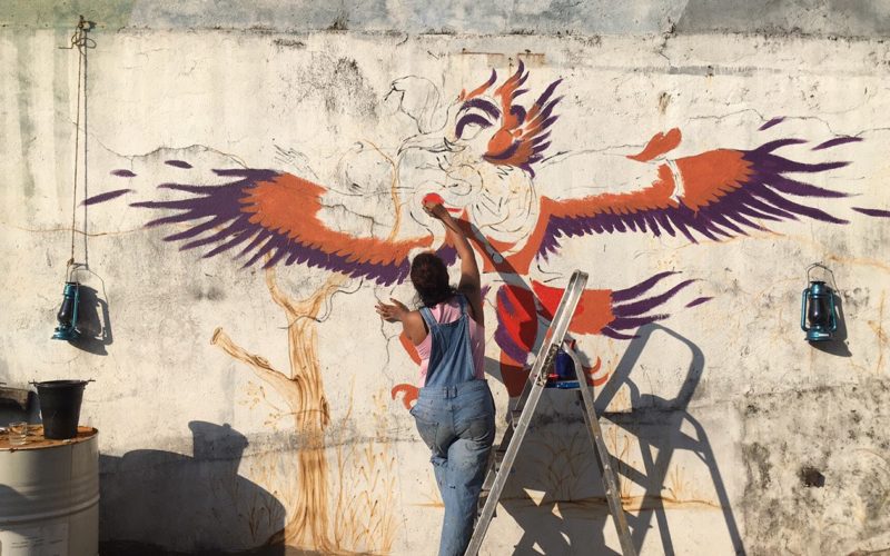
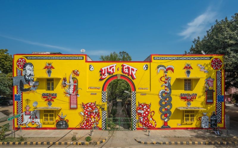
“While working on Arpona, the Roman-Germanic Museum in Cologne was a valuable source of inspiration because there are countless ancient stones with Roman inscriptions. Stone is not easy to work with, and the hammer and chisel are not filigree tools. You have to use force to apply it and mistakes cannot be corrected. The final result is a typeface with...
Sudtipos — Ale Paul — Buenos Aires, Argentina
“Clockmaker’s aesthetic references encompass Victorian, Art Nouveau and Art Deco advertising and typography, with specific influence from John F. Cummings’ all-caps — and never digitized — type design Elandkay. Creating a diverse and playful set of uppercase ligatures was an almost endlessly enjoyable task; they are one of Clockmaker’s most charming features. It is an impeccable choice for designs requiring...
Grilli Type — Lucerne, Switzerland
“The motivation to design GT America stemmed from an urge to bridge the gap between two genres of typefaces: European Grotesque and American Gothic. The typeface takes the straightforward systematic approach from the first one and the strong expression of the second one. To commemorate the release of the typeface, we’ve published the website www.gt-america.com that likewise fuses Swiss modernism...
A’Design Award and Competition 2021 — Architecture, Building & Structure Design Winners — Italy
A’ Design Award & Competition is the world’s leading international annual juried competition for design. The A’ Design Accolades are organized in a wide range of creative fields to highlight the very best designers from all countries in all disciplines. Organized under various categories based on Locarno classification of economic sectors and industries — the A’ Architecture, Building and Structure...
Katerina Korolevtseva — Kyiv, Ukraine
“I wanted to have a big idea under my first typeface, Misto, which was to develop tourism and bring life to my native town, Slavutych, which has great cultural potential. The visual inspiration came from the architecture of the city. It’s amazing to feel the influence of doing something good for my city simply by creating a typeface. Also, it’s...
NM Type — Noel Pretorius, María Ramos — Stockholm, Sweden / Santiago de Compostela, Spain
“For our experimental variable font Movement we found inspiration in an unusual field, contemporary dance. We observed and analysed the movements of the South African dancer Andile Vellem. Trying to translate his movements into type forms was a challenging but wonderful learning experience. Connecting art and design is something we look for and feel passionate about. We also connected art...
høly — Odysseas Galinos Paparounis — Athens, Greece
“Decoracha started as a design-school project, when I was asked to create a typeface in typography class. I came up with the idea of a quirky font, inspired by Art Deco principles and the antennae of a Madagascan cockroach. In 2017 it became the most successful crowd-funded font in history. In 2019, we launched of a holistically re-branded version of...
Ryan Bugden — Brooklyn, New York City, USA
“My typeface Spec came from a curiosity about abstraction. I wondered how abstract I could make the alphabet while maintaining readability based on context. At first, I refreshed my knowledge of Gestalt principles of grouping and started making absurd sketches of individual letters. Then I proceeded to subject all other glyphs to the same intangible principles of abstraction that I...
Rostype Fonts — Rosario, Argentina
“The main inspiration behind our Potra font was space, the future, time and the universe. With simple and rounded strokes, we sought to generate a technological and futuristic aesthetic. Regarding morphology, an attempt was made to imitate the path that a shooting star generates in its displacement.”...
BÜRO UFHO — Singapore
“We want to evolve 3D type beyond basic depth extrusions, so we view them as type sculptures, where we not only design the frontal face of a type, but all its facets. How would the type look from an angle as a real-life installation? How do we make it delightful when people walk around these fabrications in the real world...
Studio Triple — Jérémy Landes — Berlin, Germany
“When I start a font, I try to create something new and this often leads to prohibited places, shapes that we learn to avoid. Jaune started like that. My pretty simple idea was, instead of avoiding accidental encounters between paths in the bolder weights, to close everything and to treat these encounters as sticky but slick inktraps. I started with...
29Letters — 29LT — Madrid, Spain
“The end of 2020 will mark the release of a new 29LT type system inspired by the Aljamiado script used by the Moors of medieval Spain. After months of intensive research on the manuscripts and analyzing their linguistic and typographic aspects, we came up with the idea of creating a new type family consisting of several styles ranging from geometric...