Your most challenging project to date? “Definitely Soapbottle. It is particularly challenging for me, as it is the first time that my own concept has actually been turned into a market-ready product. It was created during my studies in product design, in this case my master thesis. I received so much positive feedback from people all over the world, so...
NiceLab Studio — Beijing, China
“We look forward to more applications of complex materials, and more new interpretations of traditional cultural expressions using modern design languages, making packaging more than just a carton, but also a convenient and beautiful lifestyle.”...
NiceLab Studio — Beijing, China
“We look forward to more applications of complex materials, and more new interpretations of traditional cultural expressions using modern design languages, making packaging more than just a carton, but also a convenient and beautiful lifestyle.”...
Commersart Studio — Moscow, Russia
The most challenging and satisfying projects to date? “Any design project has both difficult and easy moments. We try to penetrate the essence of the business and the ideology of the customer. This is probably the most difficult part, because we are at that moment effectively amateurs in a new field. But that is what makes it so interesting —...
Studio LEM — Seoul, South Korea
“Packaging design is the most basic yet powerful marketing channel through which a brand and its consumers can directly communicate. Since it is an essential part that determines the first impression of a product, creating an outstanding, meaningful packaging design is one of the most efficient ways to form a brand image.”...
A’Design Award and Competition 2022 — Call for Submission — Italy
In a world where there are millions of products and designs launch each year, A’Design Award and Competition was born out of the desire to underline the best designs and well designed products. Submissions are now open in 100+ categories, with popular choices including Interior Space and Exhibition Design; Architecture, Building and Structure Design; Furniture, Decorative Items and Homeware Design;...
Boér Sebestyén — Sfântu Gheorghe, Romania
“A more pragmatic approach from designers, with the aim of creating multi-functional, maybe even interactive packages. I believe that re-usable materials will take over, and plastic (hopefully) will almost completely disappear. That being said, owing to the relatively new no-waste approach, packaging design as a whole may have to transform in order to keep up.”...
Irene Arteaga Sáenz — San José, Costa Rica
“The most challenging and satisfying project was Blue Zones Packaging. I had to design an identity for each different product, but still make them all feel part of the overall brand concept and identity.”...
REDesign — Shanghai, China
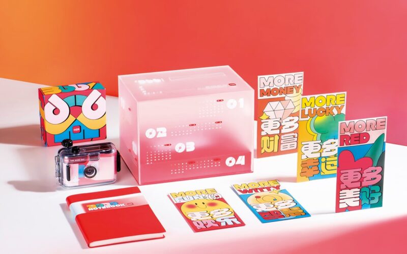
“The challenge mainly comes from communicating with the factory, which normally won’t lead to 100% perfection. Our most satisfying work so far is the 2021 RED CLUB Monopoly Game Pack. Its small chess pieces made with IPs are loved by a large number of customers. And as a Lunar New Year gift box, it effectively brings the whole family together...
IdN v27n2: Packaging Design Issue — Packing With a Punch
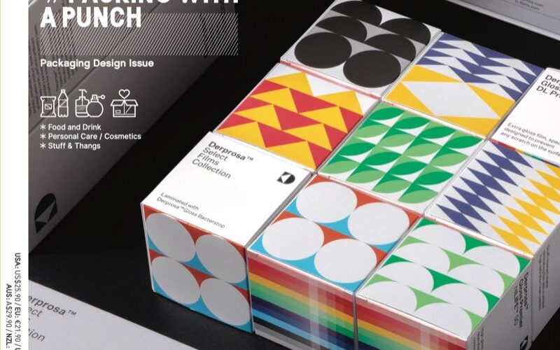
Successful packaging design is a huge challenge for graphic designers. They have to leave their comfortable 2D platforms and step into a real world full of all kinds of different materials. Touch suddenly becomes a crucial selling point. The size of the package can certainly restrict creativity, given that the material used has to both protect the product and attract...
HEAZ — Seoul, South Korea
“The iF Award-winning Sandahwa Renewal Branding project was the most challenging. The client was conflicted at first but we finally persuaded them to go for our our preferred design, which received the least feedback. In the end, it turned into an image that satisfied both brand and consumers.”...
Yuta Takahashi Design Studio Co. — Ehime, Japan
“Design isn’t just about looking. Design only makes sense by maximizing the brand’s world-view, the value of the product, and the functionality of the thing being designed. The world-view and the concept of design and brand, innovation and the value of products are two sides of the same coin, and good products are born only when the two wheels mesh...


