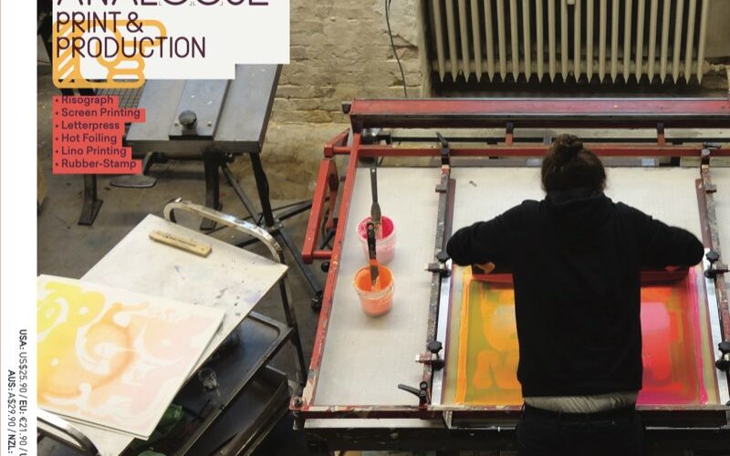
We are all privileged these days to live in a world where we can obtain almost anything with just one click on a computer. But while we pamper ourselves with such extreme convenience, the longer it goes on, the more it triggers a need for physical touch. That is probably the reason why printed goods such as newspapers, books, posters,...
A’Design Award and Competition 2022 — Architecture, Building & Structure Design Winners — Italy
A’ Design Award & Competition is the world’s leading international annual juried competition for design. The A’ Design Accolades are organized in a wide range of creative fields to highlight the very best designers from all countries in all disciplines. Organized under various categories based on Locarno classification of economic sectors and industries — the A’ Architecture, Building and Structure...
Javier Garduño Estudio de Diseño — Zamora, Spain
“Our best work, I think, has been what we achieved for AleaIactaEst olive oil, since it is a project that we were involved in from scratch. We created the naming, the logo and the packaging for luxury oil that has been a success, both in terms of sales and public acceptance.”...
LG Household & Healthcare — Seoul, South Korea
The most challenging and satisfying projects to date? “The Belif Aqua Bomb edition in 2020. We worked with an overseas illustrator, Juan Molinet, for the first time, and it was the first project in the jumbo edition series to be released in that year. It was the theme of the Bangkok Songkran Festival, and it was difficult at first connecting...
SOT B&D — Olga Takhtarova — Kiev, Ukraine
“An interesting but quite complex project was the packaging for Winetime Seafood. The main challenge was not to overload the packaging with information. Freshness of the product had to be conveyed. The main idea was to use illustration to connect more directly with the consumer. The design was limited to three colours. This created a contrast, simplified the process of...
Butterfly Cannon — London, UK
“We live in an age of on-line shopping, hyper-personalisation and social media comms. With an undercurrent of anti-packaging sentiment. In the future, packaging as we know it will not play the role it does today. It is already imperative to make it as sustainable as possible. It should stand out in this context and ‘deliver’ itself to the consumer in...
Petra Pilbák — Cluj-Napoca, Romania
“The most challenging packaging projects tend to be the most satisfying ones too. One of my favourite packaging projects was for Gallimaté, a French beverage brand. I had the freedom to come up with an illustration style that would fit the voice of the brand: modern, hip, premium, but also elegant, classy, sophisticated. The packaging would place emphasis on the...
Dany Vo — San Francisco, USA
“A big challenge is helping clients see the potential in more provocative design. I want design to go beyond expectations as there is so much competition, online and in-store, that brands truly need to say something unique. I am currently working with a talented team at Hatch Design, and nothing makes us feel more satisfied than seeing our clients’ businesses...
Szymon Fischer — Krakow, Poland
“I think we are getting more and more conscious of the environment and not producing too much waste, so I would hope to see more packaging that is either re-fillable, biodegradable or made from recycled materials. In regards to aesthetics it is harder to stand out, so I think design will play a more important role for the FMCG industry...
Lung-Hao Chiang — Taipei, Taiwan
“I enjoy fun, story-telling packaging. For example, when coffee beans are already displayed in a coffee shop, then the packaging doesn’t need to focus too much on saying ‘This is a coffee bean’. Instead, there are spaces for creativity.”...
Auge Design — Florence, Italy
“More game-changing packaging, in which the theme of sustainability will be communicated with even more powerful images. A more sophisticated and contemporary visual language will begin to be used in mass-market packaging design: products for new generations.”...
Xiangaopeng — Xi’an, China
“I want to see packaging that can bring value to society, help customers succeed in business, and promote and change the development of the design industry.”...


