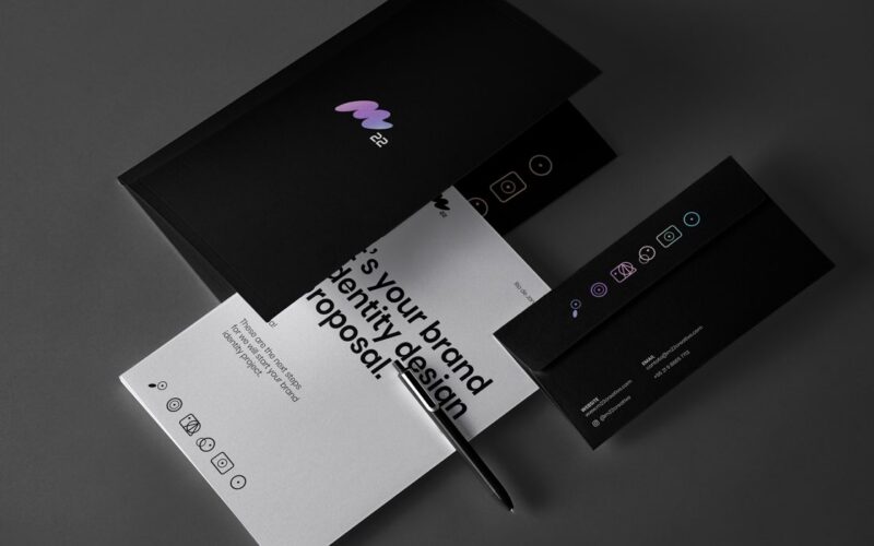
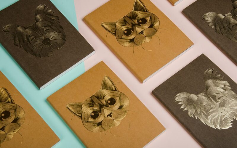
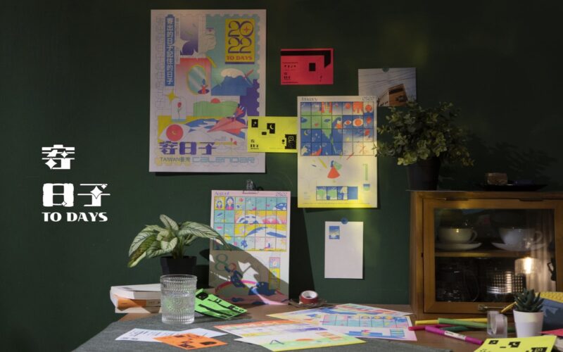
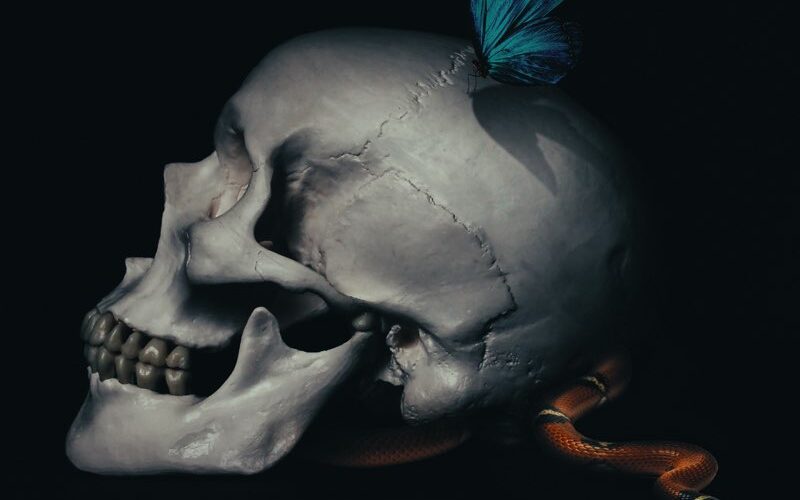
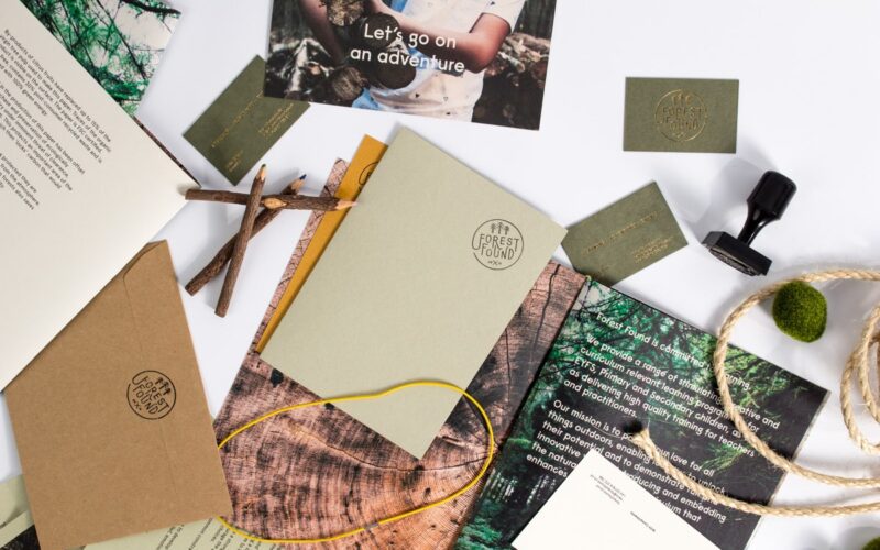
“The essence of good design work is found in the details. To highlight this we rely on some special printing techniques; in this case, I’m a big fan of spot UV, because it puts a focus on the details of the piece, especially if it is black. The biggest challenge is in finding a printing company that can do this...
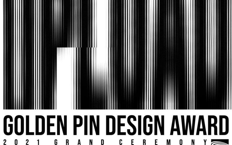
The 2021 Golden Pin Design Award Unveils the theme “UPLOAD” for the Grand Ceremony! — Taipei, Taiwan — 04 DEC 2021
The 2021 Golden Pin Design Award Ceremony will be held in Taipei on 04 DEC 2021. This year’s award ceremony has been planned by renowned producer Isaac Chen, who has lead the production team behind the Taiwan’s Golden Melody Awards multiple times. The awards ceremony will be held at Taipei’s NEXT TV television studio, and the show will be streamed...
Regio Creative Studio — Bogotá, Colombia
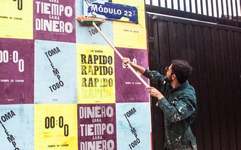
“Letterpress makes you feel like a child in the middle of a room full of Legos. The letters are assembled and disassembled, you are filled with ink — hands, arms, head and heart. When you start working on this type of printing, time passes very quickly. It is a challenge for our heads that are used to approaching design from...
HUMAN — Alejandro Flores — Mexico City, Mexico
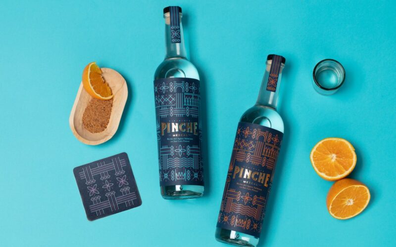
Favourite kind of print-making? “It would have to involve a production process that enhances the design solution and helps reduce the cost as well as being environmentally friendly. Reproduction and implementation are crucial parts of the design process. If it looks good on screen but is not replicable, it just doesn’t work. I think the biggest challenge is to always...
Kemalcan Başaran — Istanbul, Turkey
Kemalcan Başaran is interested in digital, spatial, editorial and identity design for branding and advertising....
Nini Sum — Shanghai, China
“Screen-printing is a medium that has the features of both human being and machine, it reproduces images in editions yet each one is different due to their hand-made nature. I especially love adding mono-printing effects into the printing process, such as spraying water onto the paper then printing on top, adding random colours onto the screen then pulling the squeegee;...
Annabel Lin & Chin Wen Hsu — Taipei, Taiwan
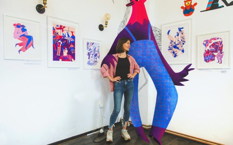
What do you like about risograph? “The most interesting thing about it is that every printing is somewhat different. It’s always a surprise to see the result and the eye-poppingly beautiful colours. The most challenging part is separating each colour into individual plates. Since we use a lot of colours and the illustrations we create are very complicated, lots of...
Little Giant — Matt Fletcher — Hamilton, Canada
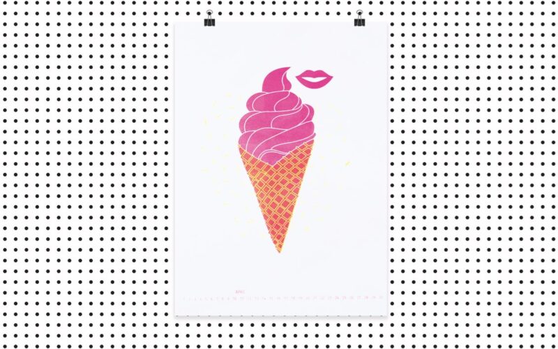
“Silkscreen printing can be cost-effective and offers you a wide range of colours. I often use silkscreen printing when working on apparel and poster projects. The experimentation with silkscreen is endless, it’s definitely one of the pros of using this method.”...
Passport Studio — Jonathan Finch & Rosalind Stoughton — Leeds, UK
Why do you like combining multiple page sizes and formats? “We like it because we find that it is both functional and visually pleasing. It’s good for sectioning within a book, creative reveals, and also encouraging the reader to pause and absorb the content on the page.”...
Anna Lindner — Utrecht, Netherlands
Why do you like screen-printing? “I like it because it feels as if you’re creating something digital with an analogue method. Unlike a digital gradient, you can’t control exactly where the transition comes, and for every print you make it changes slightly as the inks are blending. But it can also feel very liberating to not have control over every...
Katerina Voronina — Berlin, Germany
“Silk-screen is my favourite print technique. It is quite a complex sequential printing method, requiring many steps and full concentration. If you make a mistake somewhere, you may ruin the whole work and then you will have to start over. For me it is like meditation. Immersion into the process can temporarily disconnect me from the world of mobile phones...
Studio Hoekhuis — Ivo van de Grift — Arnhem, Netherlands
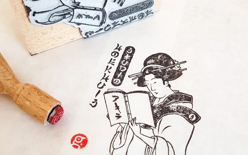
Why do you like stamps and ink? “The use of stamps forces me to think in black and white and leave out all clutter. I love that every time I use a stamp the outcome is slightly different. It all depends on the kind of paper, the amount of ink and applied pressure. Also, with every new stamp, I’m amazed...
