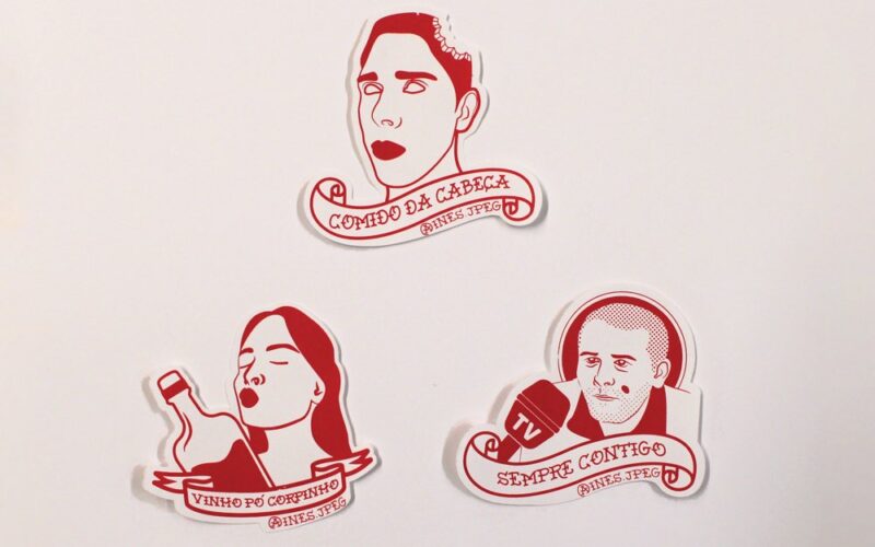
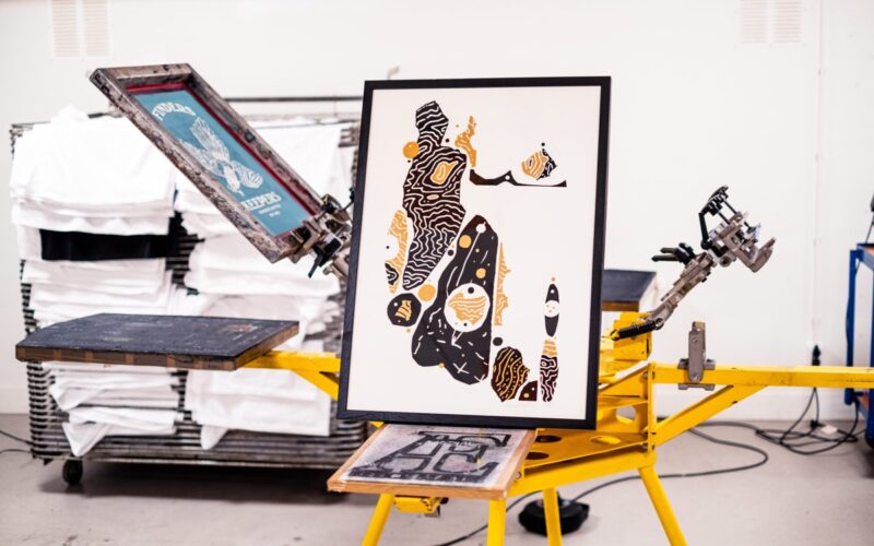
Why do you like screen-printing? “It is exciting and satisfying to be able to replicate colours that maybe we have only seen on the screen in real life, in a hand-made way. In terms of challenges, the more colours a project has, the longer the whole process will be, along with higher costs. Additionally, the method requires a bigger budget...
STOCKHOLM17 — Lorenzo Gaggiotti — Stockholm, Sweden
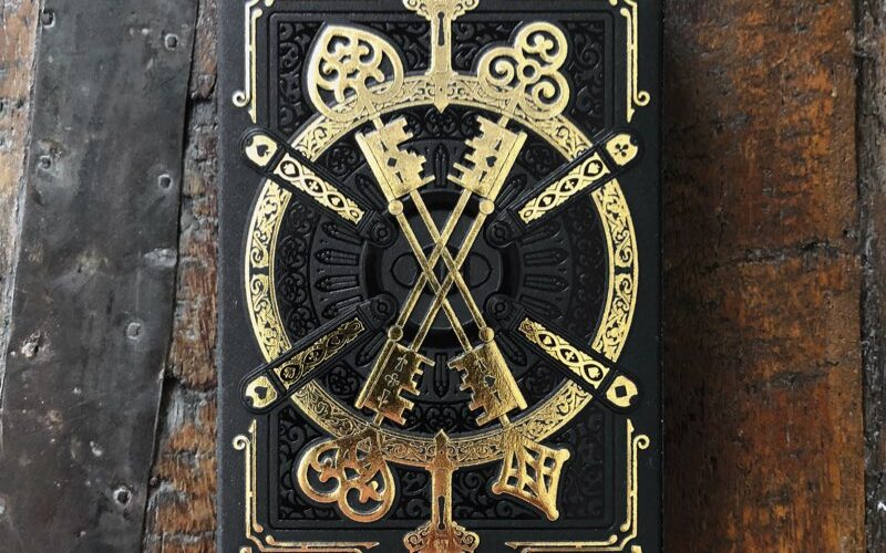
“I am very fond of letterpress with ink and foils of any kind, or just with blind embossing/debossing. I like the tactile feedback that a letterpress print gives. The depth of the impression on the right paper enhances the design. Also, the fact that letterpress machines are hundreds of years old and still perfectly and precisely working clashes with today’s...
Flowing Design — Taipei, Taiwan
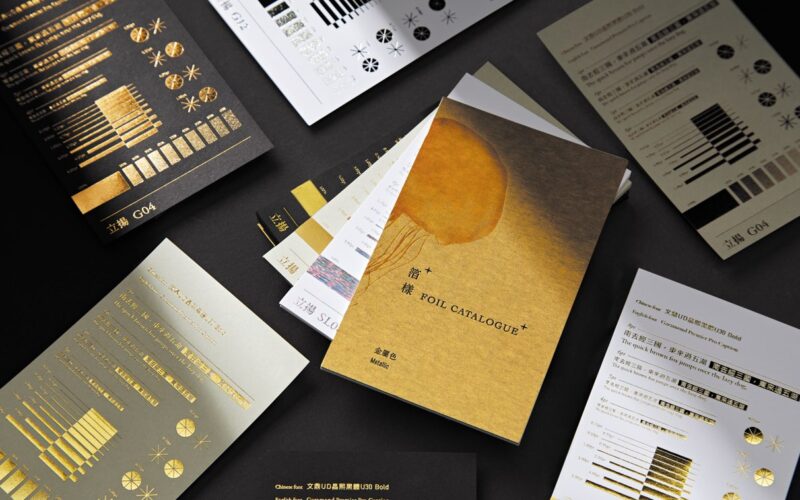
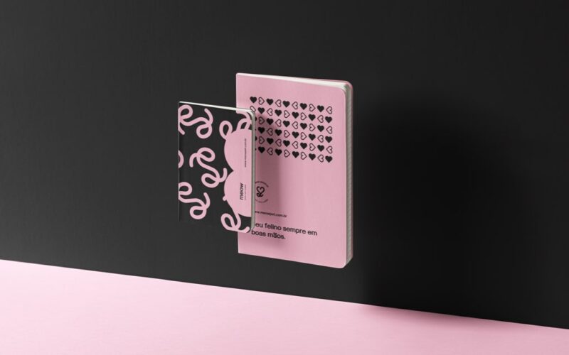
Why do you like hot-foil stamping? “It is between art and craft, dependent on heat, pressure and paper nature. Just a small difference can cause different results. It is like re-interpreting the work with a new look. The paper itself and the effect of hot-foil stamping are likely to change as a result of the making/manufacturing process, storage environment and...
Kadir Çıtak — Istanbul, Turkey
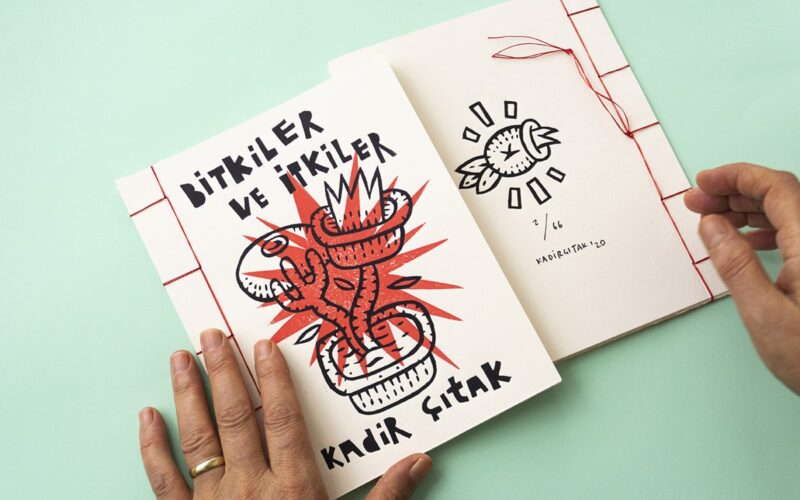
“For me, using my hands is more magical and opens me up to new adventures by chance compared to using a tablet or computer. My biggest challenge was to print and self-publish an artzine at home on lockdown time. It was a really huge experience to create it from the beginning to the end with a little printing press.”...
Nate Azark — 12 Line Studio/Grass Fed Studio — Chicago, USA
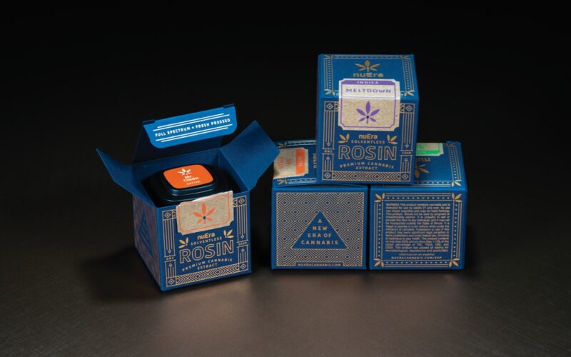
“Our expertise is rooted in decades of strategy, branding and packaging,” adding that “Our team believes that the cannabis industry’s growth is vital to improving people’s lives and we value working with those who feel the same way”....
Hong Da Design Studio — Hong-Da Jiang — Taipei, Taiwan
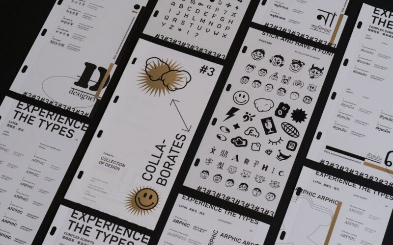
“I love fluorescent colour printing and metallic colour printing, which can be repeatedly over-printed to create different layers and change the vision. Hot foil is also a printing process that I like very much. Changing the size of the dots, the layout of the reprint warp surface is similar to the effect of a progressive layer.”...
The Archivist — Min & Woon — Bangkok, Thailand
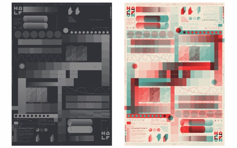
Why do you like hand-pulled silkscreen? “I like how it allows us to simply customise almost everything in the combination, using assorted papers, crazy colours, experimenting with ink opacity, printing sequence and imagine all the possibilities out there. As a screen-printer, the challenge is in how we manage our resources for each project as well as dealing with artists and...
Geíza Barbosa — Belo Horizonte, Brazil
“I like the creative freedom I have with posters. The biggest challenge at this stage is to keep the purpose of colours accurately in stationery; some arts with special effects of gradient or a holographic system need to undergo some changes in colours at the time of printing and this can end up taking the essence of the project.”...
Marka Collective — Petko Petkov & Nuray Nury — Varna, Bulgaria
Why do you like speciality printing/production? “Well, in packaging there are a lot of opportunities and the competition is quite big. The challenging part is to create something interesting that stands out from the crowd.”...
The Best Design Winners for the 2021 Golden Pin Design Award and Golden Pin Concept Design Award Have Been Announced — Taipei, Taiwan
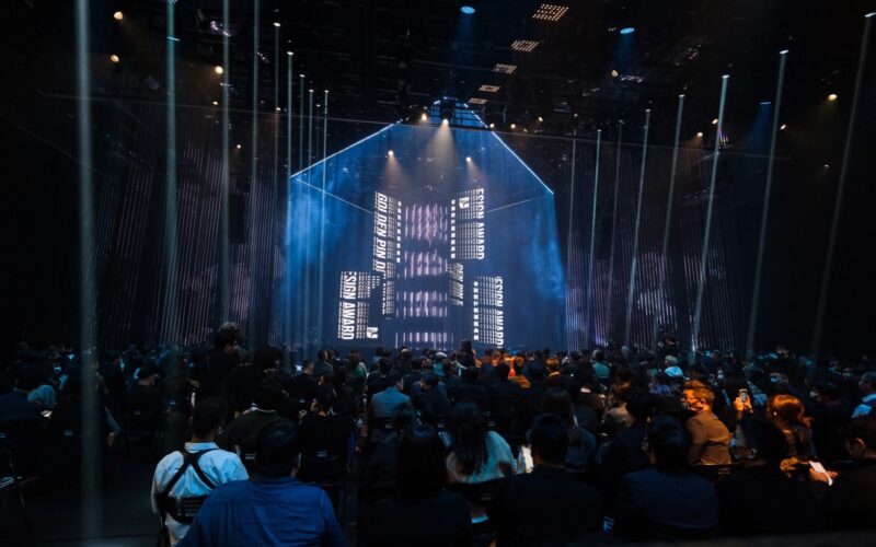
The Golden Pin Design Award Ceremony has been held on 04 DEC 2021 in Taipei. The winners of the highest honors have been revealed at the ceremony. This year, the Golden Pin Design Award and Golden Pin Concept Design Award received nearly 8,000 entries in total from 28 countries around the globe, with many categories of designs in contention. After...
Nick Liefhebber — Utrecht, Netherlands
Why do you like screen-printing? “For me it’s the best way to create unique and cost-effective reproductions of my work. You can use special inks, print on a large scale, print on different materials such as paper, wood and textile, and you can experiment and print variations of the same work. Things that would cost a lot if you had...
ALAND — Alan Wong — Hong Kong
What attracts you to letterpress? “It combines old and new culture. It represents different generations of printing production and craftsmanship. And I do like the textures and colours created by the pressure. It is meticulous. The challenge I always find with it is printing on different papers. It doesn’t always turn out as I expect it to.”...
