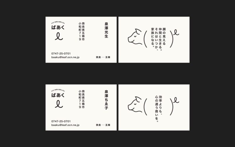
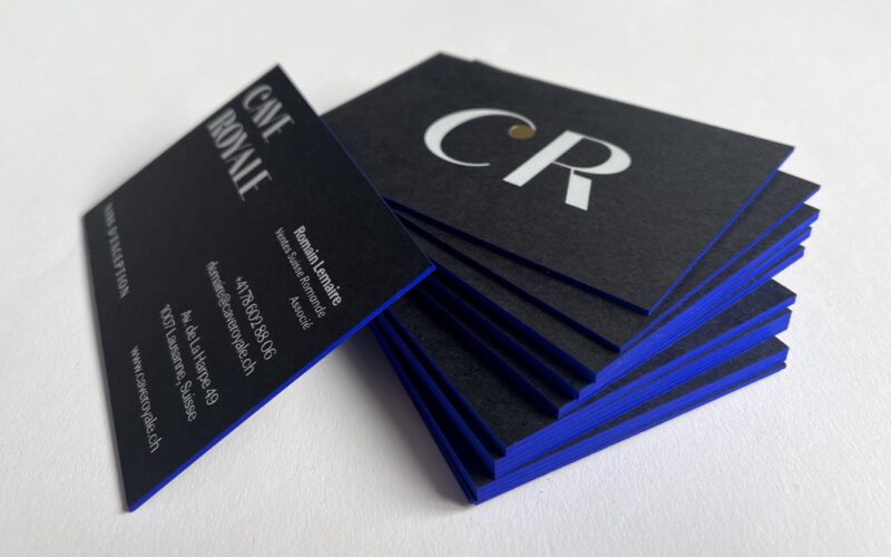
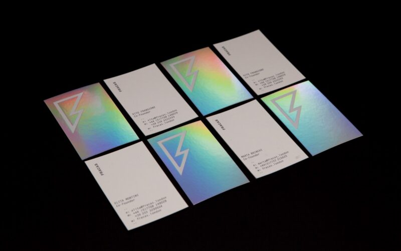
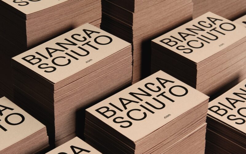
“A business card is a common touchpoint of the brand identity. Within a confined and limited space, it extends the brand expression creatively, not just with a strong idea, typography and design, but also with the physical aspects of paper tactility and printing treatments for a nuanced experience when one receives and holds it.”...
badcass — Philippe Gully — Quimperlé, France
What makes a good business card/identity design? “It should be memorable and eye-catching and best represent the function and personality of the person presenting it. You should be able to take pleasure in it and use it to display your individuality. While it is true that excessive use of printing techniques cannot replace a simple, practical design printed in black,...
A’Design Award & Competition 2024 — Top Winners Announced — Italy
A’Design Award & Competition, one of the World’s largest and most diffused international design awards announced results of the 2022-2023 design competition: 1,884 Winners from 114 countries in 140 different design disciplines. Entries were carefully evaluated by an internationally influential jury panel composed of established scholars, prominent press members, creative design professionals and experienced entrepreneurs who devoted great care and...
Marta Brinchi Giusti — Lanzarote, Spain
“A modern customised business card is a direct marketing tool. While search-engine optimisation, e-mail marketing, and other marketing methods fetch leads and potential clients, business cards are more effective. This is because of the in-person meeting that goes with sharing of the cards.”...
Michele Verze — Sydney, Australia
“A business card has immense power. When I hold one in my hand, in particular a good one, it influences the perception I might have of the person who gave it to me. The thickness of the paper, the embossing or choice of fonts, are some of the many reasons why a strong card is like a miniature work of...
NOSIGNER — Yokohama, Japan
“A good identity communicates the brand’s philosophy in an intuitive visual way that transcends language. Therefore, a good identity should be straightforward in its existence and philosophy. A good business card is an important introduction that provides the first experience of the brand’s philosophy and services.”...
Seegno — Braga, Portugal
Creative, straightforward and personal....
Deep Fried Creative — Hangzhou/Beijing, China
“First of all, we think that uniqueness should be one of the important principles for designers when designing, because our audiences are exposed to massive amounts of information every day, and unique designs have a better chance of being remembered by them. Paper texture and the printing process are very important.”...
Miriam Skalli — Germany
Miriam reflects her love for materials in her work, especially in her print projects....
Siang Sinn Design — Wang Bo Wei — Kaohsiung City, Taiwan
“A good business card/identity design should clearly express the brand and personal characteristics, and must be unique.”...
Both Studio — Melbourne, Australia
“For us, a good business card considers the interplay of paper stock, weight, and print finishes and techniques, such as a foil or an emboss, something tangible and interactive. As for good identity design, we always try to create consistency without monotony within our projects; this gives our visual identities a framework to grow and adapt whilst remaining recognisable into...
Muhammad Junaid Ur Rehman Tahir — Pakistan
“There are still benefits to having a physical company identity and business cards. They give people something they can hold and look at to remember a company’s services and contact information. This makes it easier to form a personal connection and leaves a stronger impression. In addition, physical business cards can be useful in situations where electronic devices may not...
