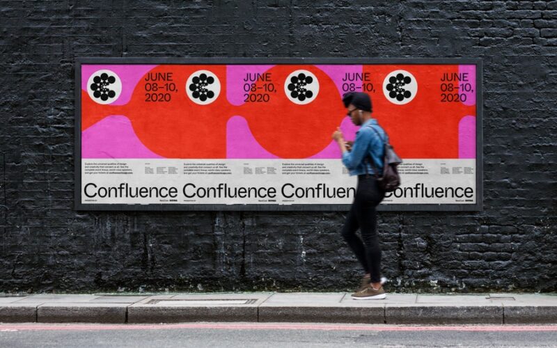
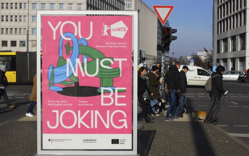
“The need for singularity and my graphic design background led me to develop over the years a unique and recognizable style.”...
Struvictory.art — Victoria Strukovskaya — Hrodna, Belarus
“I would advise designers to avoid setting lengthy passages of text in display fonts and reserve them exclusively for headings or titles, where they can serve as elegant design elements. Individual decorated letters of my fonts look great as a logo. To complement my fonts, I often recommend pairing them with understated serif or sans-serif typefaces, chosen based on the...
João Neves — Lisbon, Portugal
“Choosing the right typeface is about more than just selecting what looks good. Different type styles evoke different emotions and associations, making it essential to consider the context in which they’re being used. Display typefaces are usually used as focal points in a design, so they need to do a clear job at establishing hierarchy. This becomes particularly important when...
A’Design Award and Competition 2025 — Call for Submission — Italy
In a world where there are millions of products and designs launch each year, A’Design Award and Competition was born out of the desire to underline the best designs and well designed products. Submissions are now open in 100+ categories, with popular choices including Interior Space and Exhibition Design; Architecture, Building and Structure Design; Furniture, Decorative Items and Homeware Design;...
Lahis Strobel — Cuiabá, Brazil
“For me, the main challenge is maintaining originality. In a world where there are many copies, maintaining originality is a huge challenge. Another one is not to get carried away by ideas that might take you away from the real aim of the project. Sometimes we fall so in love with our ideas that we end up being blind to...
TypeType Foundry — Pennsylvania, USA
“Things that must be considered are legibility and readability because these are the main principles in typography with the aim of conveying messages easily and well. Apart from that, aesthetics (i.e. additional elements such as the serif model used, the swash model used, etc.) must also be considered to further beautify the typography. The choice of font type also has...
Carmen Nácher — Spain
What should designers consider when selecting display typefaces? “I guess taking into consideration what kind of work they’re doing and what they want to express with it. It’s not the same if I’m making a poster for an art exhibition where the display type with the event’s title can be a bit weirder or hard to read (plus having, for...
Casper Schutte — Spook Design Co. — Cape Town, South Africa
“I design my typefaces primarily for myself, if other designers can use the fonts that’s an added bonus. So I don’t really face the challenges that type designers who design for an audience face. But I would say my main challenge is to ensure that my fonts tell a story I’ve scrapped countless typefaces that just did not have enough...
Kipară Studio — Sabina Chipară — Amsterdam, Netherlands
“Designing decorative and display typefaces presents unique challenges due to their distinctive nature and intended use. It’s best to have a usage in mind, either provided by a specific design brief or restrictions that the type designer sets, in order to control the design parameters with set criteria. When I design a display family, I take versatility into account. It...
Morgane VanTorre — Paris, France
“Designers need to pay attention to what the font expresses. What does the image of the letters convey? What emotions? What connotations (historical, cultural, technical…?) Letters have little voices of their own, and it’s vital to know how to discern them to enhance the message shared. Pairing is the same story. I’d say that you also need to be able...
Hondo Studio — United Kingdom
“When it comes to selecting fonts, we typically base it on the concept of the project we’re working on. We check if there’s enough differentiation between fonts to utilise them for various functions, such as titles and body text, or if we aim to be expressive in specific areas of the project. Occasionally, we enjoy designing them ourselves or involving...
Jad Maza — Iloilo, Philippines
“Usually, there are certain parameters to follow so that letterforms become readable when set in a paragraph. With display typefaces, this isn’t an issue — you are free to add as much character to the characters in your font as you wish. But it could take time to figure out the shapes of some glyphs while keeping them identifiable and...