What do you enjoy most about designing event and festival identities? “For this particular festival identity design, I enjoyed learning about heritage in the Philippines. As someone who hasn’t visited there yet, it’s interesting to get to know more about their culture. They have a cold dessert named halo halo, which reminds me of Singapore’s ice kacang; both are colourful...
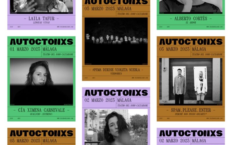
Tiquismiquis.club — Roberto Espartero & Juan Martín — Málaga, Spain
What do you enjoy most about designing event and festival identities? “The chance to experiment with visual elements and current trends. The temporary nature of these projects allows us to create memorable and clear identities while adapting to different spaces and media depending on the event. This flexibility provides plenty of creative opportunities, as each festival has its own context...
IdN™ Creative Country® — Germany
A designers’ guide to major cities worldwide! A regular column comprising a comprehensive creative guide to the world’s leading talent hubs. An ever-expanding map of the best contacts, education programmes, exhibition spaces — and all those special “secret” spots and hangouts!...
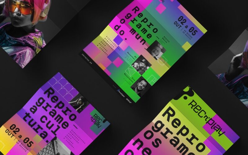
Rafa Lima — Recife, Brazil
How is event and festival identity design different from other projects? “Festivals are often linked to culture, music, art, and cinema, which provide rich visual resources and greater creative freedom. Communication tied to culture tends to be more disruptive, allowing for compositions, illustrations, and typography with more personality.”...
IdN™ Creative Country® — Italy
A designers’ guide to major cities worldwide! A regular column comprising a comprehensive creative guide to the world’s leading talent hubs. An ever-expanding map of the best contacts, education programmes, exhibition spaces — and all those special “secret” spots and hangouts!...
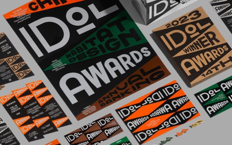
Medium Design — Jinxin Liu — Nanning, China
“There are some differences between event and festival design. The latter is highly time-sensitive, as it is only used for a specific period, while brand design is intended for long-term use. Secondly, event or festival design needs to reflect more of the spirit or traditions associated with the occasion, incorporating many symbols, colours and concepts. In contrast, other identity projects...
Eager Zhang — Los Angeles, USA
“I enjoy the artistic expression and celebrative nature of festival identities. In many teams I’ve worked with, the festival identity usually gives me the largest room for experimentation. A lot of my whimsical image-making ideas, such as using generative code or unexpected tools to make typefaces, came into real-world projects first in such project contexts. And there are usually big...
IdN™ Creative Country® — Japan
A designers’ guide to major cities worldwide! A regular column comprising a comprehensive creative guide to the world’s leading talent hubs. An ever-expanding map of the best contacts, education programmes, exhibition spaces — and all those special “secret” spots and hangouts!...
IdN™ Creative Country® — Argentina
A designers’ guide to major cities worldwide! A regular column comprising a comprehensive creative guide to the world’s leading talent hubs. An ever-expanding map of the best contacts, education programmes, exhibition spaces — and all those special “secret” spots and hangouts!...
h3l Branding Agency — Horacio Lardiés — New York, USA
What do you enjoy most about designing event and festival identities? “The need for innovation that projects in this category require. Its essential omnichannel and multi-platform nature enables the creation of a highly sophisticated conceptual framework, providing room for metaphors and the context for a playful, dynamic, and flexible narrative that can be expressed in various ways without needing a...
Lorenzo T MB — Pordenone, Italy
How is event and festival identity design different from other projects? “This is probably overstated, but every project is unique. In the roles I’ve held, events are often closely tied to a defining image or mascot — whether it’s an illustration, photo, or object. My approach typically begins with identifying this core artwork, defining the language and then building the...


