Shanghai-based graphic design studio Lin Shaobin has created packaging for tea that uses burnt paper to emulate traditional Chinese ink paintings of misty mountains. The Mountain Tea Song packaging project was commissioned by Guangzhou Zifang enterprise for a restaurant in the Chinese city of Guangzhou called Song’s Chinese Cuisine. Lin Shaobin took design cues from The post Lin Shaobin emulates...
Good design can reduce voter errors says postal vote envelope designer
Christopher Patten has redesigned the mail-in envelopes for North Carolina ahead this year’s US presidential election to make them clearer so the chance of votes not counting is reduced. Patten simplified the absentee application and certificate form on the back of the North Carolina mail-in voting envelope, which will be used for the US election The post Good design can...
OlssønBarbieri makes minimalist chocolate packaging for CF18 Chocolatier
Plastic makes way for moulded paper in this chocolate packaging designed by Norwegian practice OlssønBarbieri to inspire a more mindful approach to materials. The packaging forms part of a wider visual identity created for local confectionary business CF18 Chocolatier, which has been shortlisted for this year’s Dezeen Award in the graphic design category. In a The post OlssønBarbieri makes minimalist...
Google ditches signature Gmail envelope in revamped logo
The envelope stamped with the red letter M, which has featured in every Gmail logo since its launch in 2004, has been abandoned as part of a new simplified, multi-coloured brand identity for Google’s G Suite tools. While the M remains, set on a transparent backdrop, the letter itself is chubbier with only the central The post Google ditches signature...
Pantone releases taboo-breaking Period red colour
Colour company Pantone and health brand Intimina have collaborated to create an «active and adventurous» red colour to start a positive conversation around periods. The blood-red hue is presented on a Pantone-branded card with an outline of a womb and ovary with a menstrual cup inside. Intimina makes several different models of these reusable cups, which The post Pantone releases taboo-breaking...
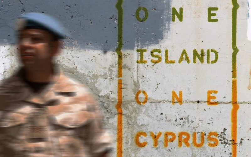
UNbuffer postcards explore the symbols of Cyprus’ ceasefire line
Graphic designer Alexandros Kosmidis has created UNbuffer, a series of postcards that explore the United Nations’ line between the Greek and Turkish sides of Cyprus. Kosmidis created the graphic design project as a petition for peace and the end of Turkish occupation of the island. The project has been shortlisted for Dezeen Awards 2020 graphic The post UNbuffer postcards explore...
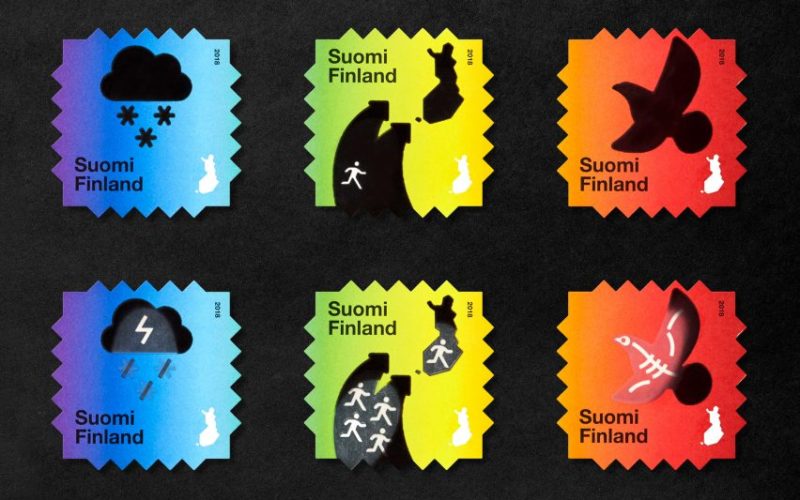
Berry Creative designs Climate Change stamps with heat-reactive ink
These stamps by Finnish studio Berry Creative feature images of birds and snow clouds that turn into skeletons and thunderstorms when heated to send a message about the consequences of climate change. Commissioned by the Finnish Post, the Climate Change stamps aim to offer an innovative way of communicating the negative effects that rising temperatures The post Berry Creative designs...
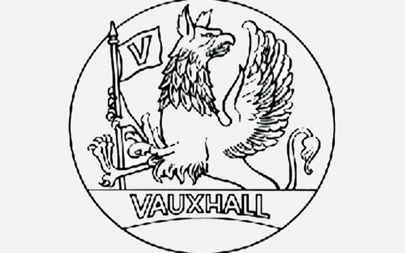
Vauxhall launches new «confidently British» flat logo
British carmaker Vauxhall has revealed a flat, minimal version of its griffin emblem to replace its three-dimensional logo that had a metallic look. Opting for a «cleaner» and more modern design, the new logo sees the griffin’s wing, which previously swooped around from the right side of the bird, removed entirely. Alongside the griffin the flag held by the The post Vauxhall launches new...
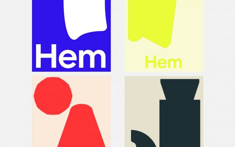
Hem launches new brand identity by Made Thought
Dezeen promotion: Swedish furniture company Hem has launched a new visual identity featuring shapes based on popular products from its archive. The rebrand reflects «a new chapter» for Hem after a year of growth for the company, during which it relocated to a larger headquarters in Stockholm and opened its first permanent studio in New The post Hem launches new...
Atkinson Hyperlegible typeface is designed for visually impaired readers
Graphic designer Applied Design Works has collaborated with the nonprofit organisation Braille Institute to develop a «hyperlegible typeface» for the visually impaired community. The font family, which is named Atkinson Hyperlegible after Braille Institute founder Robert Atkinson, is composed of distinct and exaggerated letterforms crafted by Applied Design Works to increase character recognition and the The post Atkinson Hyperlegible typeface...
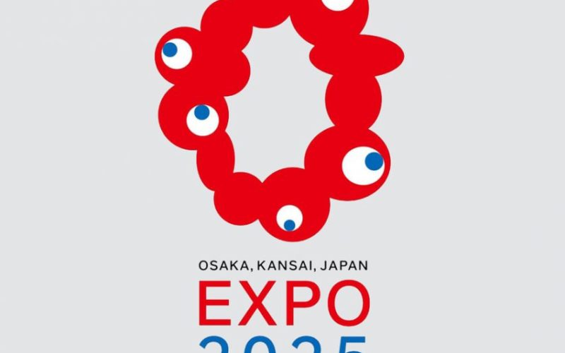
Expo 2025 Osaka logo revealed as ring of red blobs
Graphic designer Tamotsu Shimada has unveiled the logo for the Expo 2025 Osaka, which is an irregular ring of red circles that appears to include five cartoon-like eyes. Shimada’s winning logo, called Inochi no Kagayaki-kun, is a rough outline of the Japnese city of Osaka’s shape, realised in a circle of red blobs. Five of The post Expo 2025 Osaka...
Global designers collaborate on Li Beirut typeface to support victims of blast
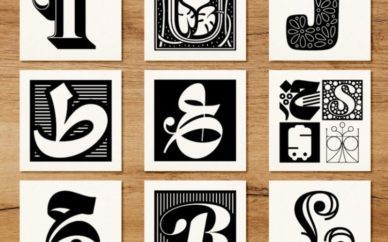
Beirut-born type designer Nadine Chahine has commissioned a typeface from contributors including Erik Spiekermann and Mamoun Sakkal to raise funds for victims of the devastating explosion in Beirut. Li Beirut, which means «For Beirut» in Arabic, consists of over 300 glyphs and was designed by 157 creatives from all over the world. The glyphs have been combined The post Global designers collaborate...


