La Liga Profesional de Fútbol presentó de manera oficial su nueva identidad visual, un cambio profundo en lo estético que llega en un contexto en el que, sobre el césped, casi todo se mantiene igual. Para la temporada 2026 se conservan el formato de competición y la cantidad de equipos, pero la imagen de la máxima categoría del fútbol argentino...


Javier Jaén, no se diga más
Divertido, cercano, natural, Javier Jaén no podía ser de otra manera. Conversamos en exclusiva con el autor de algunas de las piezas más inteligentes y profundas de la ilustración española. Hablamos de su profesión y la creatividad; de la industria y el negocio; hablamos de diseño, de su vida y de la vida. La entrada Javier Jaén, no se diga...
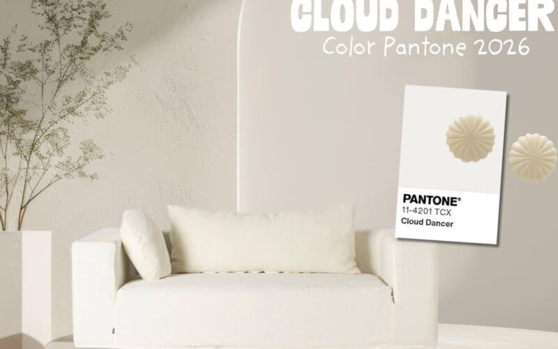
Cloud Dancer, el blanco elegido por Pantone como color del año
El Pantone Color Institute ha dado a conocer su apuesta cromática para 2026 y, por primera vez desde que existe este programa, el protagonismo recae en un blanco. La referencia elegida es Pantone 11-4201 Cloud Dancer, un tono suave y luminoso que la propia firma describe como un blanco ondulante cargado de serenidad, pensado para ofrecer una especie de «silencio...

Así es la nueva identidad de Mapfre: logotipo, color y tipografía
Mapfre ha activado uno de los movimientos más relevantes de su historia reciente: la actualización de su identidad visual. No se trata de un gesto puntual ni de una operación estética, sino de un proyecto pensado para ordenar una marca compleja, global y con múltiples negocios bajo un mismo sistema. El trabajo, desarrollado junto a… Ver artículo La entrada Así...

Joan García Pons — Barcelona, Spain
“For me, the artistic and conceptual vision always takes precedence. When there’s a strong creative drive, I find it far easier to overcome technical hurdles and pick up new skills. With technology evolving so rapidly, it’s impossible to stay on top of everything, so I focus on what serves the idea. That balance—prioritising creativity over pure technical mastery—not only keeps...

IdN™ Creative Country — Saudi Arabia
A designers’ guide to major cities worldwide! A regular column comprising a comprehensive creative guide to the world’s leading talent hubs. An ever-expanding map of the best contacts, education programmes, exhibition spaces—and all those special “secret” spots and hangouts!...
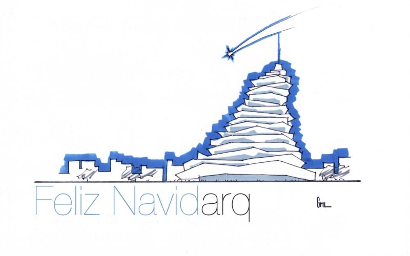
Postales de Navidad de arquitectos: concursos, creatividad y ciudad
Cuando se juntan Navidad y arquitectura pasan cosas muy interesantes: la mirada técnica del arquitecto se mezcla con el ambiente festivo y aparecen postales navideñas que son algo más que un simple saludo. Son composiciones cuidadas, llenas de guiños a edificios, ciudades y espacios que forman parte de nuestra vida cotidiana, reinterpretados con un toque mágico y muy personal. En...
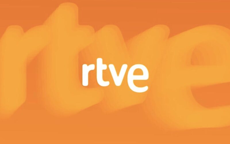
RTVE renueva su identidad visual coincidiendo con su 70 aniversario
RTVE ha iniciado el año con un movimiento destacado en el terreno del diseño: una actualización profunda de su identidad visual en pantalla que acompaña la celebración del 70 aniversario de Televisión Española. El cambio no rompe con la imagen consolidada de la corporación, pero sí introduce una puesta al día integral de todos los elementos gráficos que el público...
ClydeStudio (Arthur Clyde Roger) — Paris, France
“The emergence of new technologies—whether in 3D or design more broadly—is always an opportunity, not a hurdle. I usually come across these tools through online research, peer conversations, or by studying others’ creative work. Each one has the potential to expand my visual language, even if it means learning something entirely new. That process can be complex, but I find...
A’Design Award & Competition 2026 — World Design Rankings — Italy
World Design Rankings (WDR) ranks all the countries based on the number of designers that have been granted with the A’Design Award. WDR is to Design what Olympics is to Sports. The idea behind this friendly competition is to inspire innovations and outstanding designs. A’Design Award and Competition is one the world’s largest and most influential design award; extremely prestigious...

Massimo Vignelli, el diseñador que convirtió la claridad en sistema
La figura de Massimo Vignelli se ha convertido en un símbolo de claridad, rigor y elegancia dentro de la historia del diseño. Más allá de modas pasajeras o efectos vistosos, su trabajo consolidó una forma de entender la comunicación visual basada en la estructura, la lógica y la responsabilidad cultural del diseñador. Su manera de trabajar demostró que se puede...
IdN™ Creative Country — Serbia
A designers’ guide to major cities worldwide! A regular column comprising a comprehensive creative guide to the world’s leading talent hubs. An ever-expanding map of the best contacts, education programmes, exhibition spaces—and all those special “secret” spots and hangouts!...