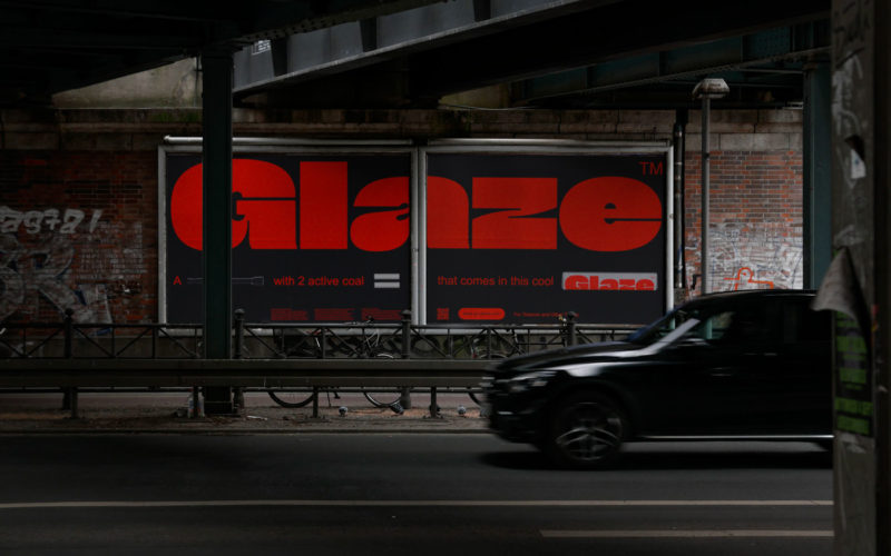
Nuevo rediseño de marca para la Agencia Tributaria de la Región de Murcia

El estudio bbrand ha desarrollado para la Agencia Tributaria el proyecto “Tributaria Store” un nuevo concepto de oficina inteligente y digitalizada más próxima al ciudadano y que potencia la calidad de los servicios que prestan.  Para la creación del símbolo de la nueva Agencia se han basado en un icono y referente en el concepto ‘tributo’ como es la...

Inter Milan removes letters FC from badge in push to be «an icon of culture»

Italian football club Inter Milan has revealed a minimal logo created by graphic design studio Bureau Borsche as part of an effort to promote itself beyond sports. Football Club Internazionale Milano, which is widely known as Inter Milan, revealed a simplified crest designed by Bureau Borsche containing an update to the original logo designed by painter Giorgio Muggiani in 1908....

eyeondesign

Go Ahead and Judge Natural Wine by Its Label

You can spot a natural wine before you taste it: a hazy, jewel-toned color fills a clear bottle with a child-like illustration sprawled across the front. Sometimes there’s a playful visual metaphor—a lightning bolt, perhaps. Or maybe there’s barely anything to it at all. Like its muddled viticultural definition, natural wine labels take many forms, but almost all of them...