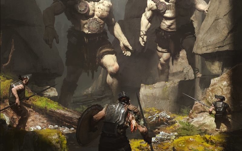
What would be the next big thing for Game Art Design? “I think that the software that artists get to use will continue to improve. I could see a virtual-reality art programme that really takes over as the medium that artists use to create.”...
Greg Danton — Five Jupiter — Vancouver, Canada
What would be the next big thing for Game Art Design? “I think that the software that artists get to use will continue to improve. I could see a virtual-reality art programme that really takes over as the medium that artists use to create.”...
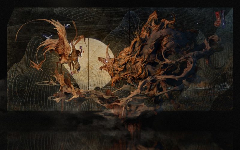
Entei Ryu — Tokyo, Japan
“If the last big thing for game art design was the transition from traditional tools to digital media, then I think the next big thing will be the introduction of AI, interactive and procedural technology. Technology saves cost on projects, optimizes workflows, and frees designers from repetitive labour and unleashes creativity more efficiently. More daringly, I imagine that the design...
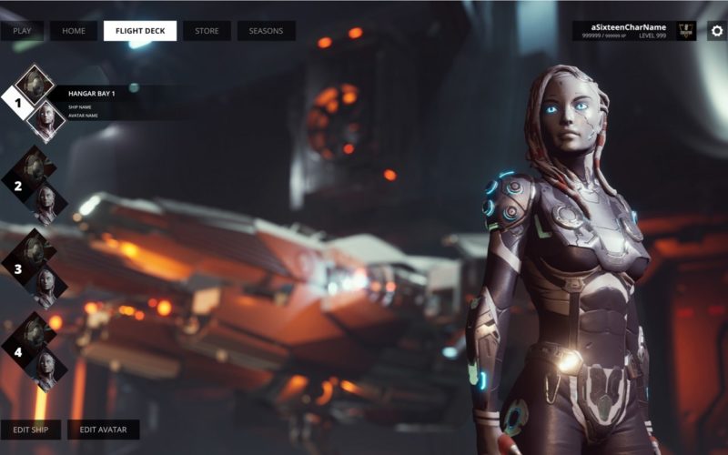
Patrick Bendermacher — Berlin, Germany
How does technology influence or expand your creativity towards Game Art Design? “For me as a UI designer, it really depends on the tools I am working with and what their limitations are. At the moment I am working a lot with Unreal Engine 4 and Affinity Designer. While Affinity Designer gives me the power to utilize Vector Graphics, I...
Arvydas Brazdeikis — Lithuania
What would be the next big thing for Game Art Design? “First, a turn to more fleshed-out nu-skeuomorphic design in big titles, as a response to a lengthy period of minimalism. Every next art trend seems to be born as some sort of counter-movement to what came before. Second, that early 2000s look, a so-called ‘Y2K’ design, might experience a...
Hibird Books — Hana Jesih & Peter Plantan — Ljubljana, Slovenia
“A lot of game enthusiasts dream of a new board game. In general, we believe that the most fascinating things are often in front of us. During our work on board-game history, we realised that simplification is one of the key factors of Game Art Design. The next big thing, therefore, could be a complex but graphically simplified board game...
A’Design Award and Competition 2021 — Final Call for Entries — Italy
A’Design Award and Competition is one the world’s largest and most influential design award; extremely prestigious with amazing jury, press recognition and high calibre laureates. It has up to 100 categories and it is for creative of all types with awards ranging from Good Industrial Design Award, Good Architecture Design Award to Good Product Design Award, Good Communication Design Award...
Diana Molytė & Dovile Kacerauskaite — Vilnius, Lithuania
“With the advancement of technology, we no longer think of the game as a one-dimensional activity. With AR technology, hybrid games become more common. It allows creators to seamlessly integrate virtual aspects of the game into well-known and liked board games. Or even create games based on location through augmented reality. Principles of gamification, such as motivation and goal seeking,...


