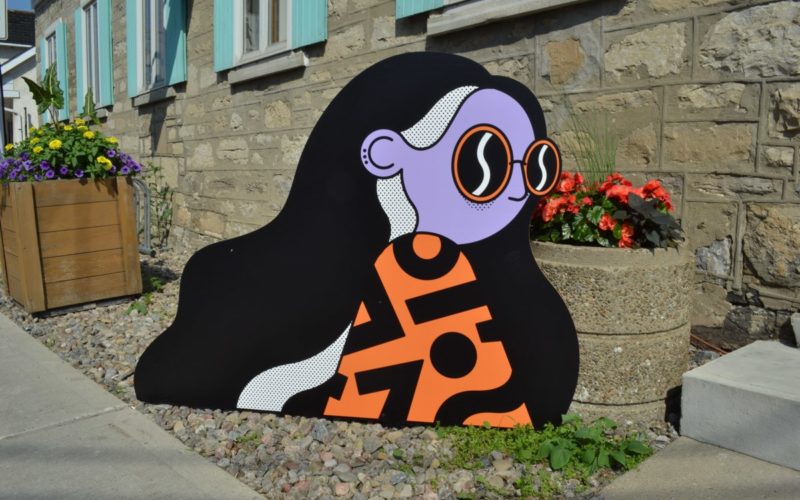
Hsinchu Prefectural Hall was completed in 1927 and is a red tile building with highly expressive plasterwork. This government building was originally a two-story reinforced brick building with a sloping wooden truss roof. For this space that retains complete meaning of its era, they took color, arrangement, and materials from the original building language and simplified it with bent metal...
Junki Hong — Seoul, South Korea / New York, USA
“When I first designed the Elephant typeface, I started to do sketches so that a slightly tilted and cut-off gap was made. In particular, I sketched r, a and k, starting with c, but I felt that it was more like a wood-carving souvenir. As soon as I designed e based on the shape of c, I thought that it...
Ten Buttons Design — Post-Information Era — Guangzhou, China
With the advent of the post-information era, Chinese characters are facing a new innovation of visual expression. The identity design of this activity highlights the role of Chinese characters in a multilingual environment, emphasizes the characteristics of information superposition and programming in the post-information era....
TypeMates — Hamburg, Germany
“Pensum, one of my largest font families, started as a contrast exercise during my studies in The Hague at the KABK type media masterclass in 2009. First sketches were based on my brush writing. The exercise included a rough sketch of a possible no-contrast and high-contrast idea. I took all the time I needed to test a lot of details...
DARE Bikes — VSRu Aeroroad — Taipei, Taiwan
VSRu’s exclusive VETOX aero handlebars, disk brake cover, integrated cable routing, aerodynamic frame shape, and exquisite hand-painted finish combine to take you on a sleek and balanced flight with the wind....
Kobu Foundry — Brígida Lourenço Guerreiro — Algarve, Portugal
“I don’t think we can consider fonts to be good or bad. It depends on the purpose and intent of their usage. If I use a digital type font that has the same characteristics as a display font, it shouldn’t be used on text, so its application in that case would be incorrect. When drawing, I consider the optical adjustments...
PiliWu-Design — Pingtung Thing 2019 — Taipei, Taiwan
Inspired by the movements of the sun, rising from the east and setting in the west, signifying the daily schedules and routines of the attentive Pingtung farmers. From humble tradition to exquisite curation....
Underware — Amsterdam, Netherlands / Helsinki, Finland
“The inspiration for Y lies in a little essay we wrote titled From Typography To Grammatography. The story begins with three letters visiting a bar. One of the letters is called Y, and is changing its form continuously....
adj. everything — Sit Down Please — Taipei, Taiwan
By using the different angles of lines to create the “Site Down Please” font, as well as the application of flurencent pink colour, it communicates a sense of new-generation vibe. Grids and fonts run through the overall exhibition, opening a dialogue between the graphic and object; past and future about chairs....
Dinamo — Basel, Switzerland
“For almost all of our designs we’re driven by an interest in how typefaces can be produced and used. Favorit Lining, for example, we came up with when a project needed an Italic but the deadline did not allow us to design one in time. Underlining felt like a valid alternative and this led us to realise that you can...
Parachute Typefoundry — Athens, Greece
“Our latest design, PF Marlet, started out by trying to visualize a serif typeface with simpler letterforms, something like a hybrid between a sans and a serif, blending simultaneously traces of fashion and nostalgia. Inspiration came from the roaring ’20s and ’30s, decades that embraced women’s independence both socially and politically. Taking intricate hints from the era, a contemporary dynamic...
Design & Make Organization (DMO) — The Brick-O — Taipei, Taiwan
This design uses red brick, furnace stone, and sodium silicate material after the removal of the surrounding wall by C-LAB to proposed a landscape installation. The wall material is transformed from barrier to an enclosing space component. The installation responds to the circular economy of this city — the ring structure itself provide exhibition and knowledge, showing the posture of...